Faded & Found
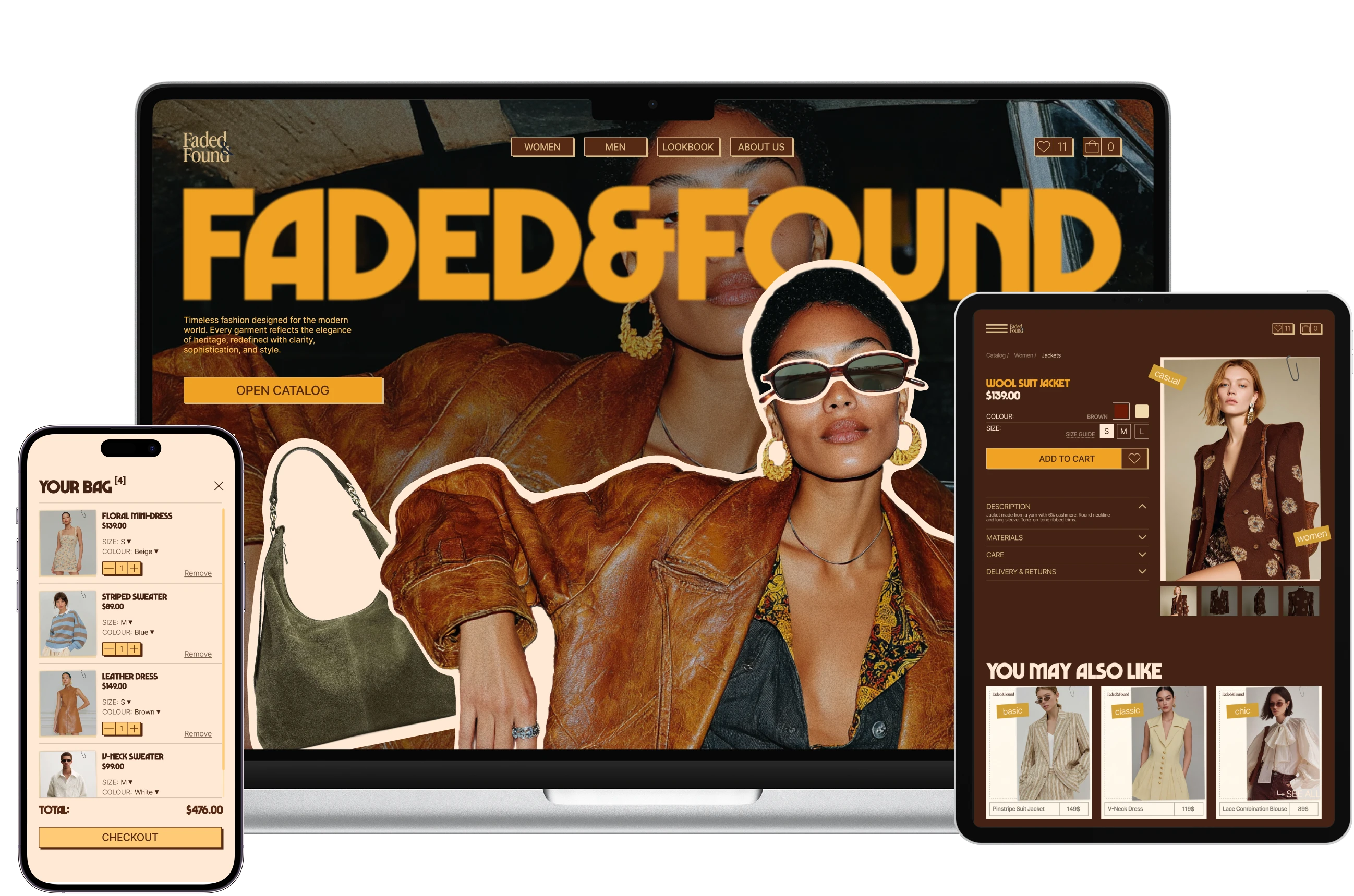
An e-commerce website for a vintage-inspired clothing brand, designed to reflect the brand’s aesthetic and create a distinctive shopping experience.
- Concept project
- UX/UI Designer
- Figma, Midjourney
- 2025
Project brief
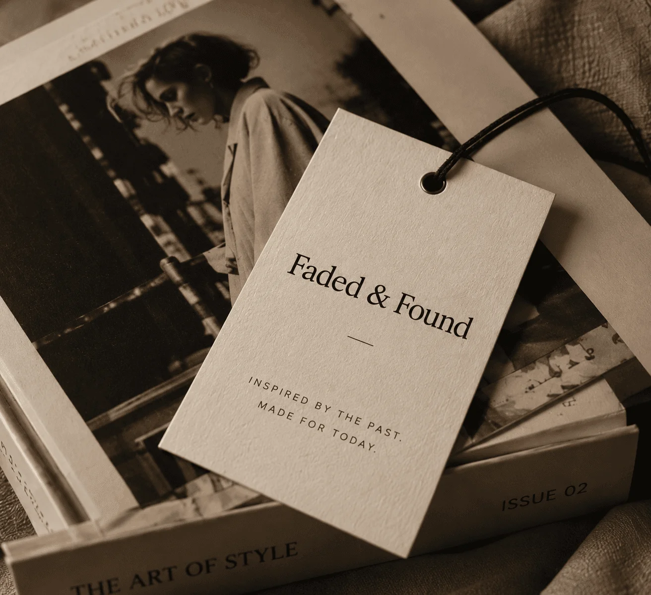
The brand
Faded & Found is a clothing brand I invented for this project. I wrote its brief the way a client would fill one in.
The brief
The brand makes vintage-style clothing from modern materials. It asked for an online store aimed at people who want the style of past eras without searching for and wearing second-hand clothes.
Key selling points
- Own production of vintage-style clothing
- Limited collections
- Worldwide delivery
Target audience
- Mostly women
- Ages 18–34
- Interests: fashion, history, culture, creative industries
Visual direction
- Magazines of the 70s–90s
- Aesthetic design
Website
- Simple, intuitive navigation
- Functionality
Problem & goal
The problem
The brand wanted its store to look like a 70s–90s fashion magazine and still be simple to navigate. Large type and collages can make the navigation hard to follow and the page feel chaotic.
The goal
A visitor recognises the brand from the first screen and shops the way they already do in other online stores. The pages keep the magazine feel and stay calm enough to find a piece and reach checkout.
Key decisions
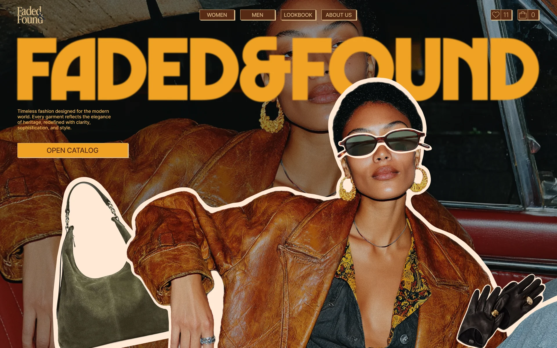
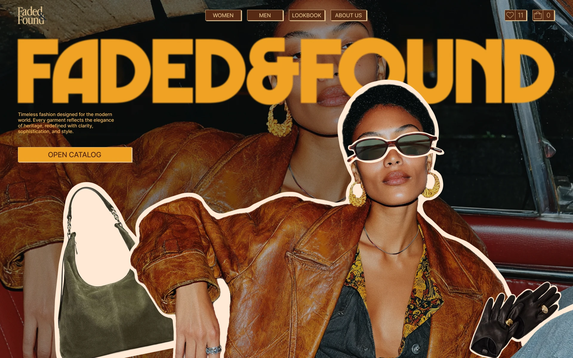
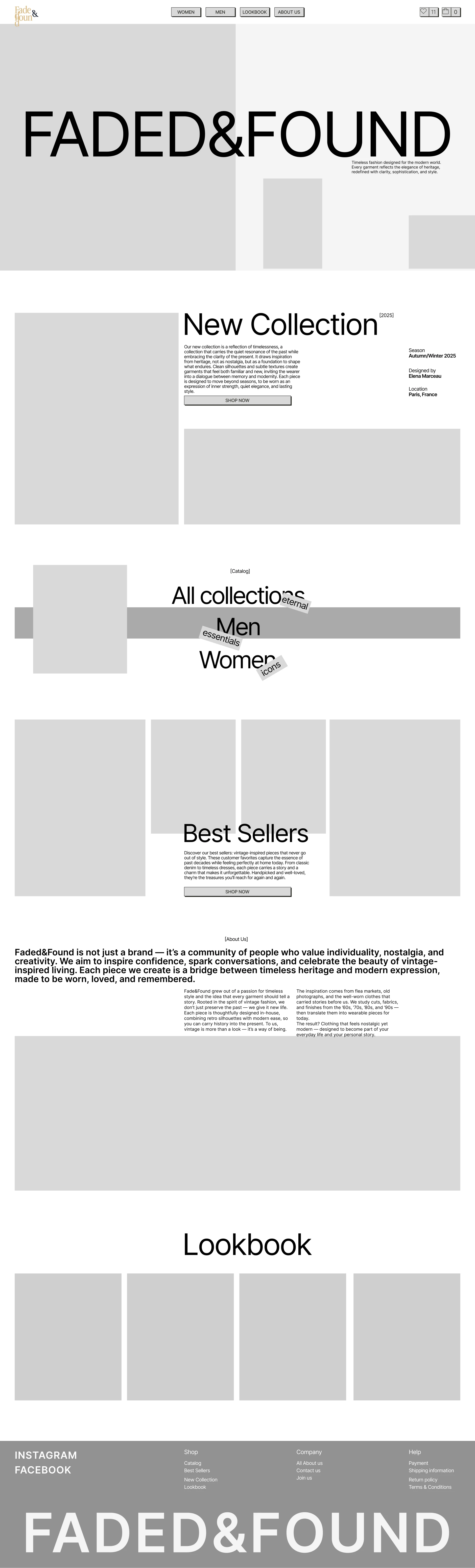
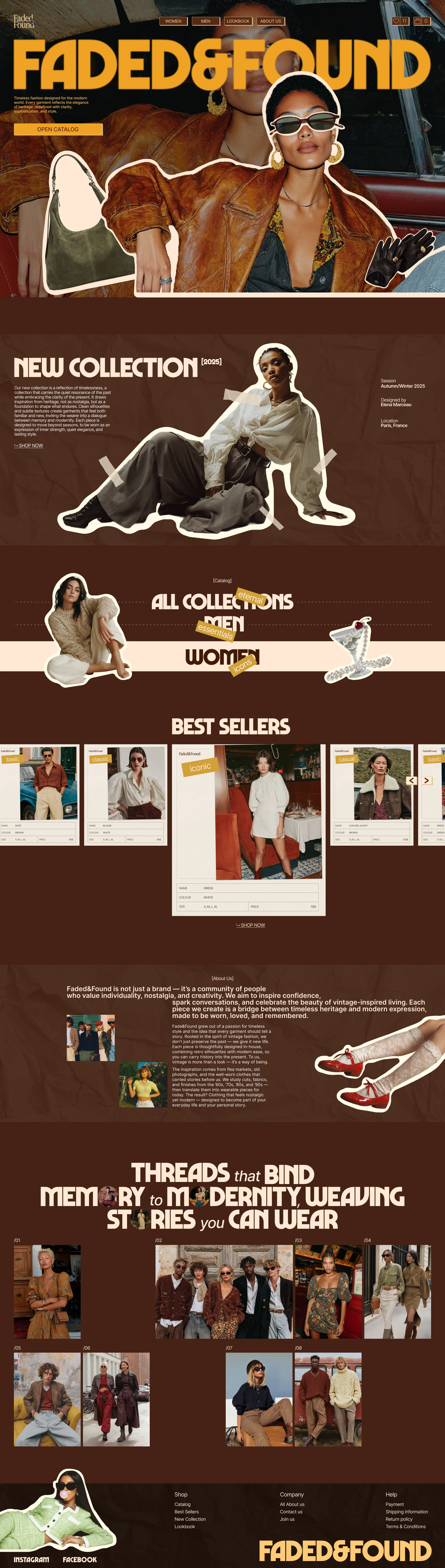
The first screen sets the brand name in large retro type over a collage of vintage-styled photos.
“Two of the three stores look plain”
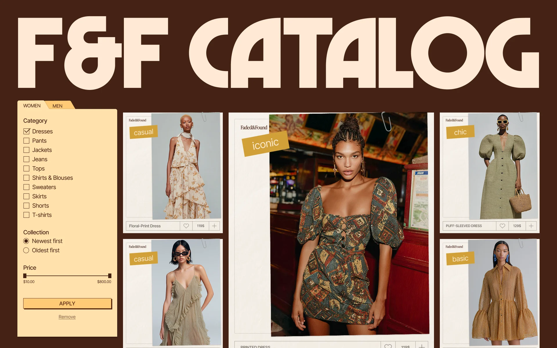
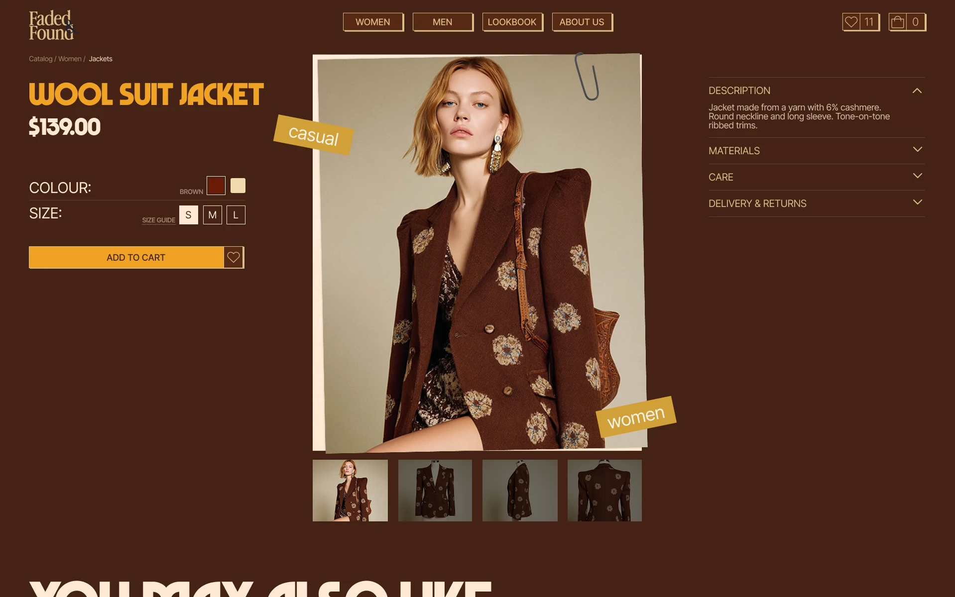
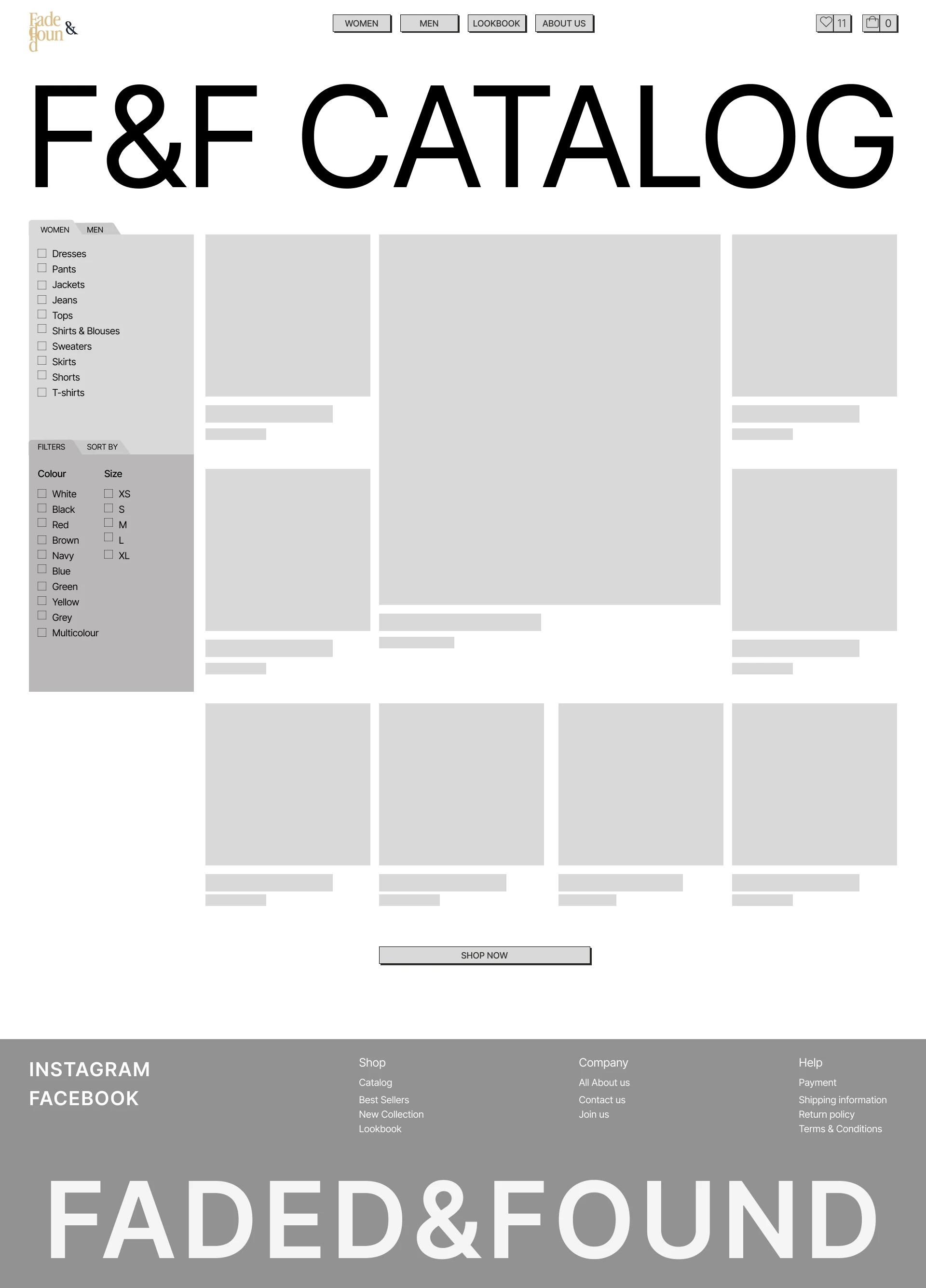
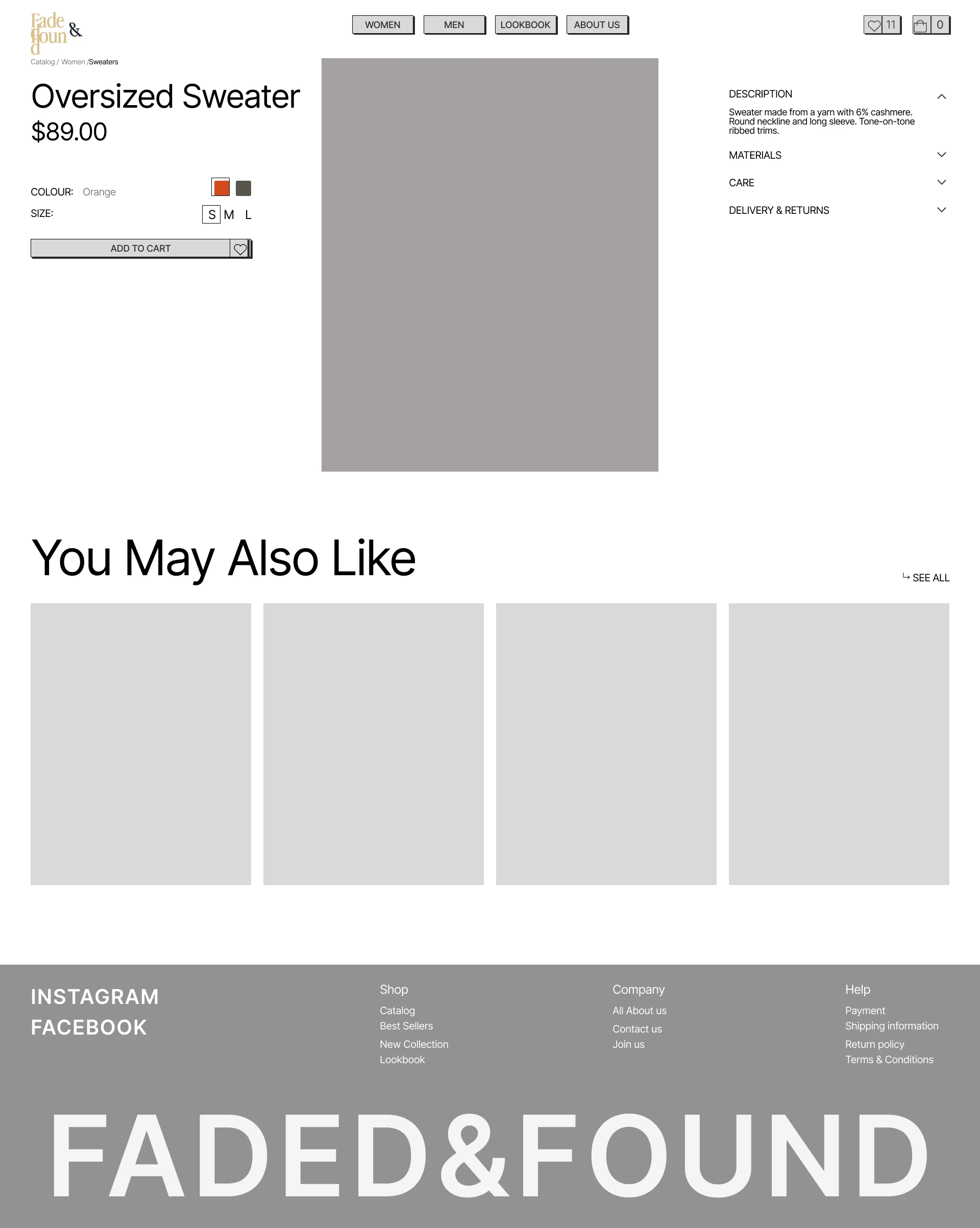
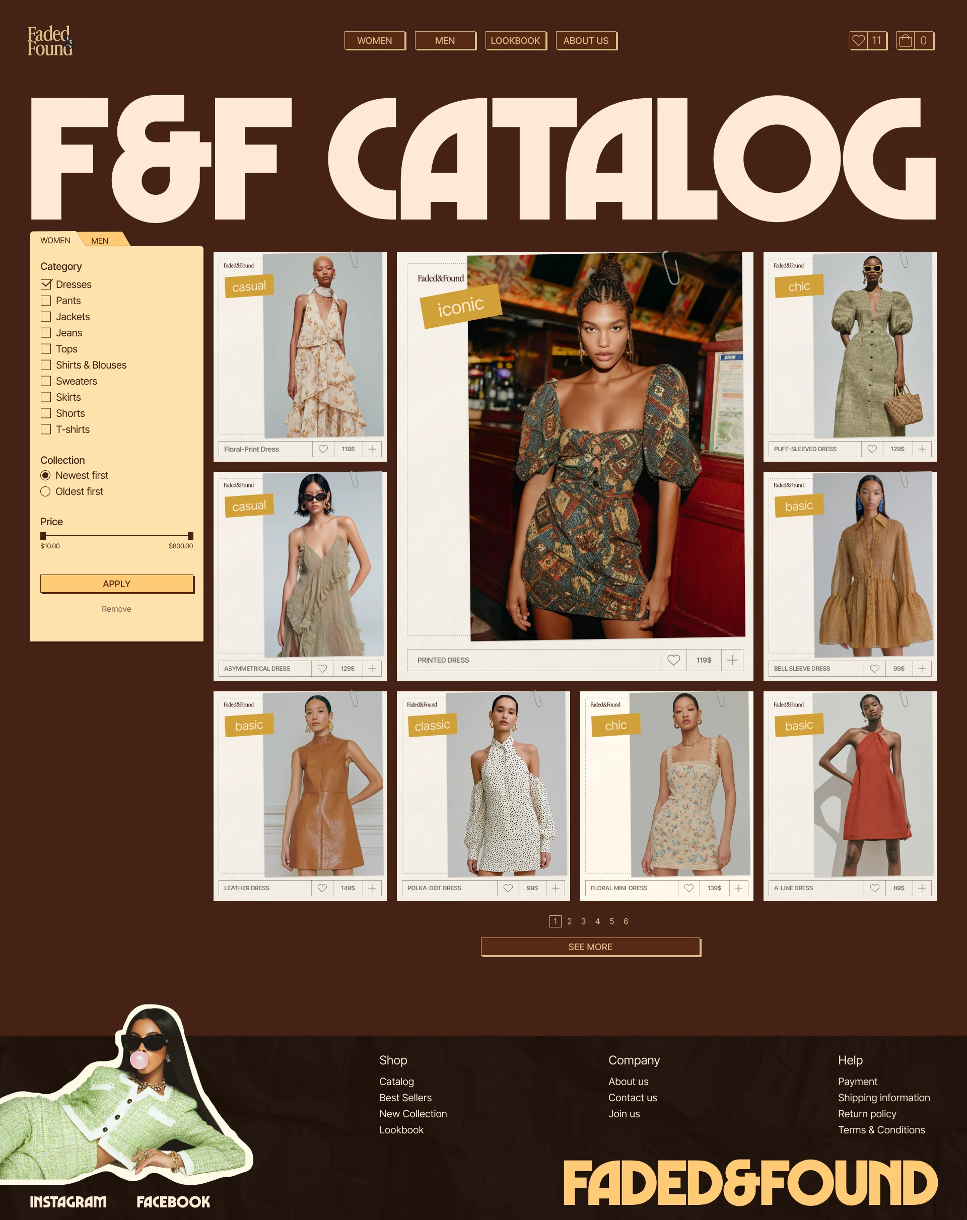
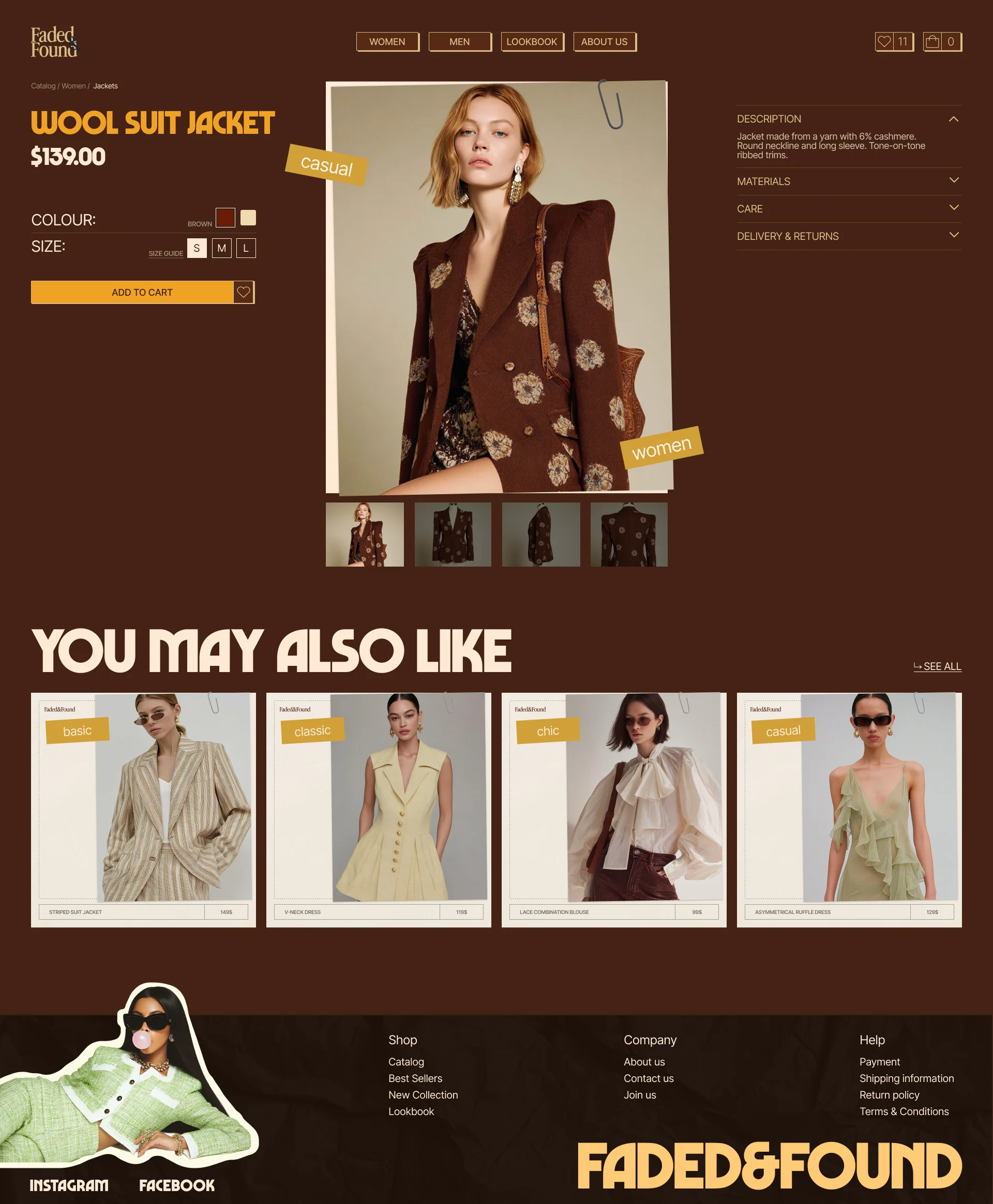
Shopping works as in the most common online stores, from the catalog to checkout. Filters sit beside the product grid, and the price and size sit next to the photo.
“Clear and familiar navigation”
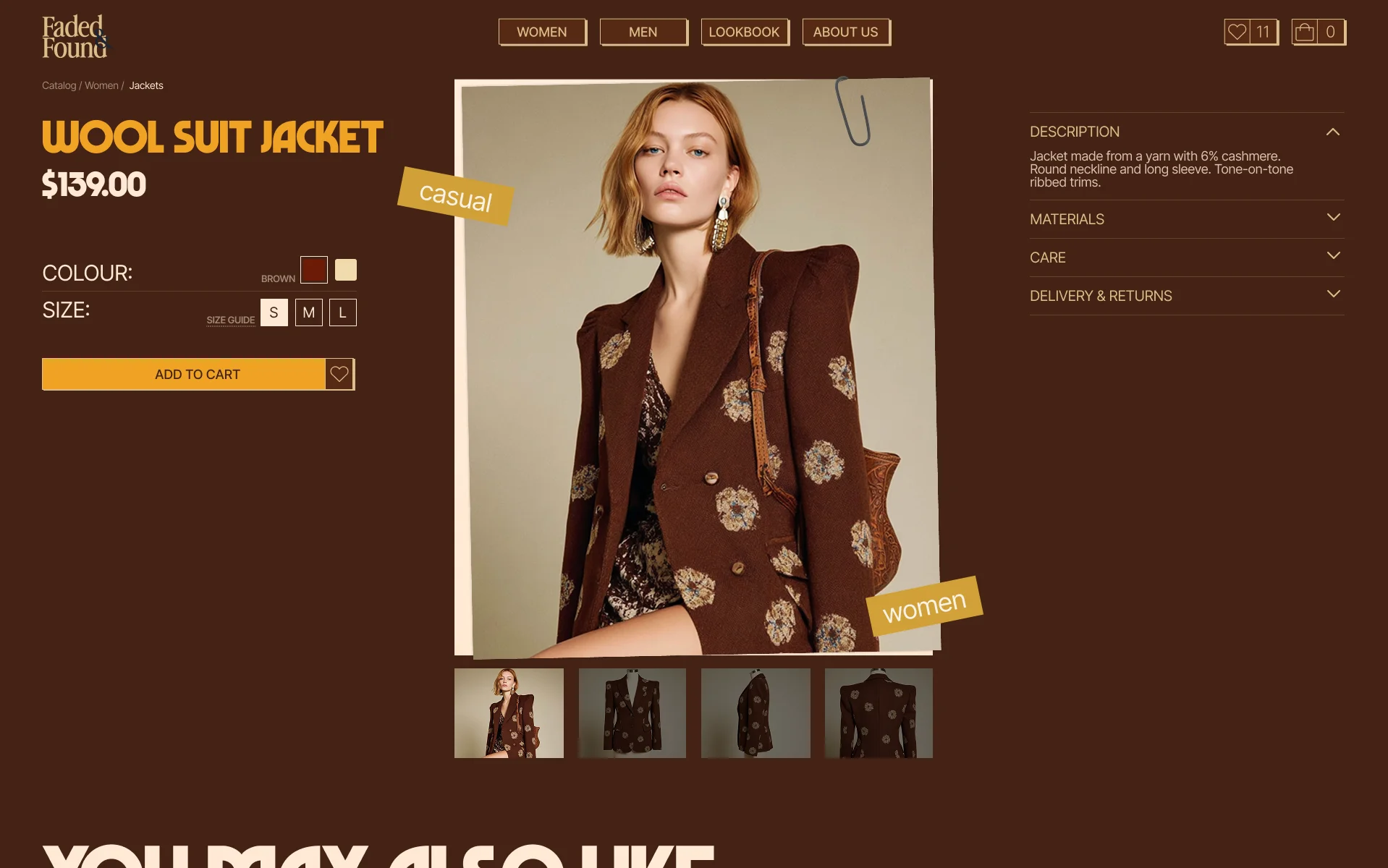
Paper tags and clips sit on the photos, and retro type sets the headings. The filters and buttons stay plain.
Process
Research
Competitive analysis
I analyzed three clothing stores, two with vintage-style clothing and one with genuine vintage, to see how they keep a large catalog easy to browse and how their design shows the brand.
What worked
- Clear and familiar navigation
- Detailed product information
- Useful filtering options
- Related product recommendations
- Clear delivery and return information
What didn’t work
- Too many filters in one store, and none at all in another
- Plain design in two of the three stores
- Only one store had a slogan that sums up the brand
- No delivery and return details on one store’s product pages
All three stores were easy to navigate and used the same standard set of pages, but two of them looked plain. This led me to keep the store’s structure familiar and let the visual design set Faded & Found apart.
Structure
Information architecture
I kept the standard set of store pages that all three stores in the research shared, and grouped them by what a shopper does: the main shopping flow from catalog to checkout, and the brand and contact pages around it.
Prototype
Wireframes
Visual Design
Visual style
The visual direction combines vintage references with a bold editorial approach, balancing the brand’s nostalgic character with a contemporary shopping experience. Warm earthy tones, expressive typography, collage-inspired imagery, and graphic details shape the store’s distinctive identity.
Typography
Colors
 Joanie Clothing
 Rokit London
 Miracle Eye
Start
- HomeBrand introduction, new collection, best sellers, brand content
Main shopping flow
- CatalogProduct browsing, categories, filters
- Product pageProduct details, size & colour options, add to cart, related products
- CartSelected products, quantity, order summary
- CheckoutPersonal information, delivery, shipping, payment
Brand & contact
- AboutBrand story, values
- LookbookCollections, styled looks, brand inspiration
- ContactStore locations, contact information
Home
Catalog
Product page
Checkout
- Marvin VisionsBold, distinctive, retro-inspired
- InterNeutral, functional, highly readable

Final design
Home
The home page opens with the brand’s look and a way into the catalog.
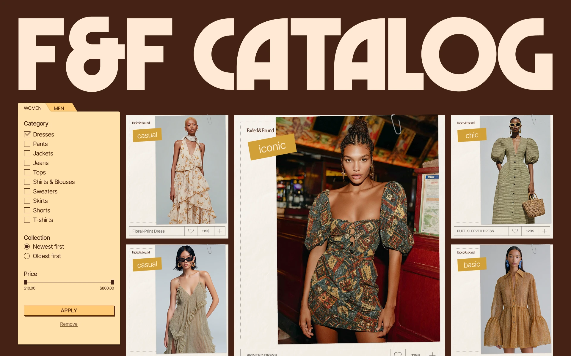
Catalog
A shopper narrows the catalog with filters and sees the price under each piece.
Product page
A shopper chooses a colour and size right beside the photo.
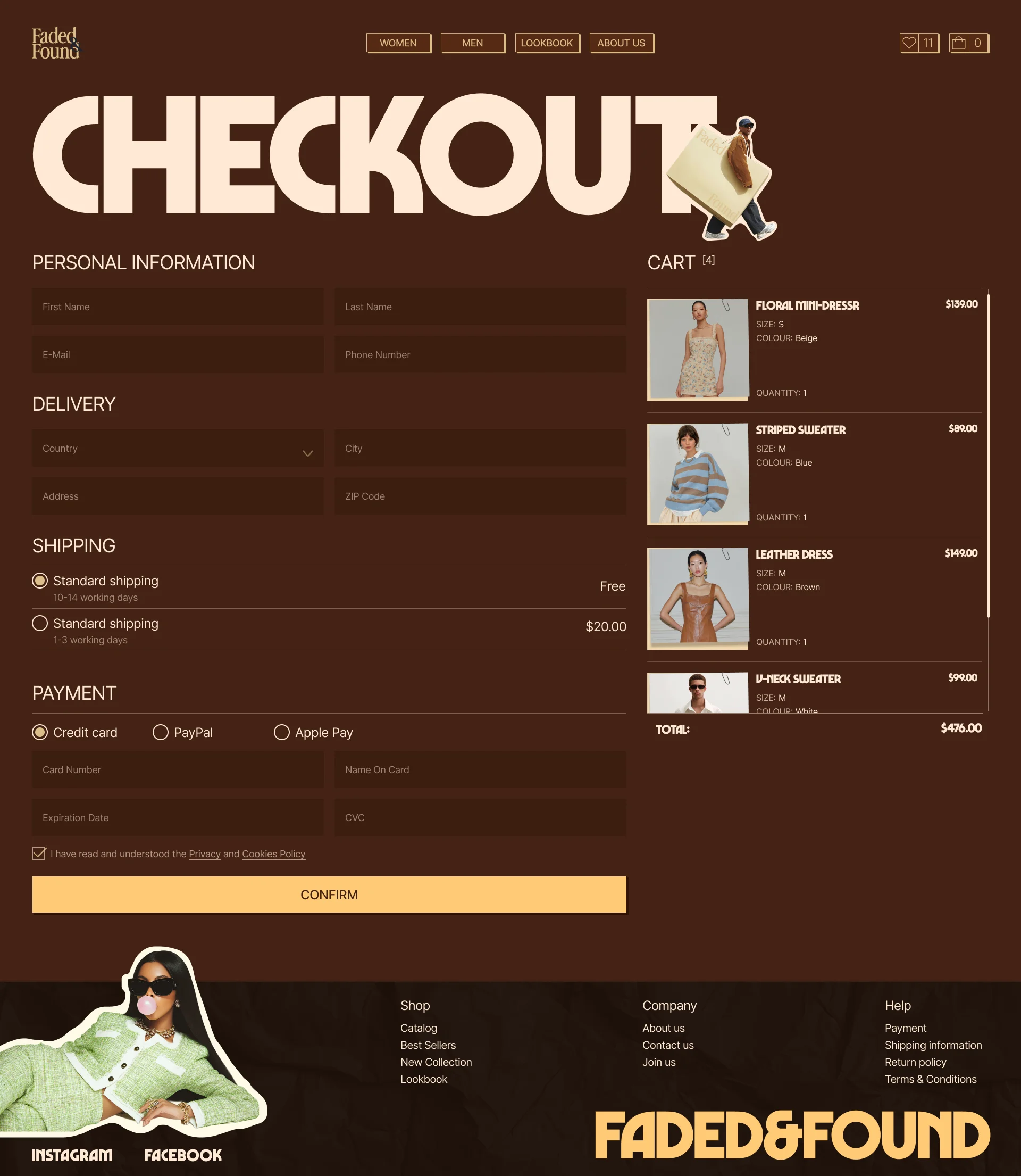
Checkout
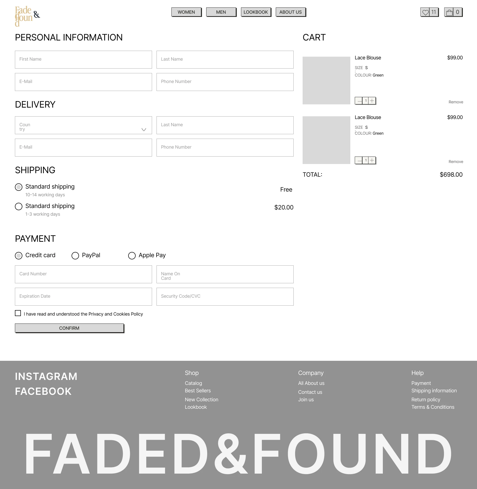
The order is placed on one page, with the bag beside the form.
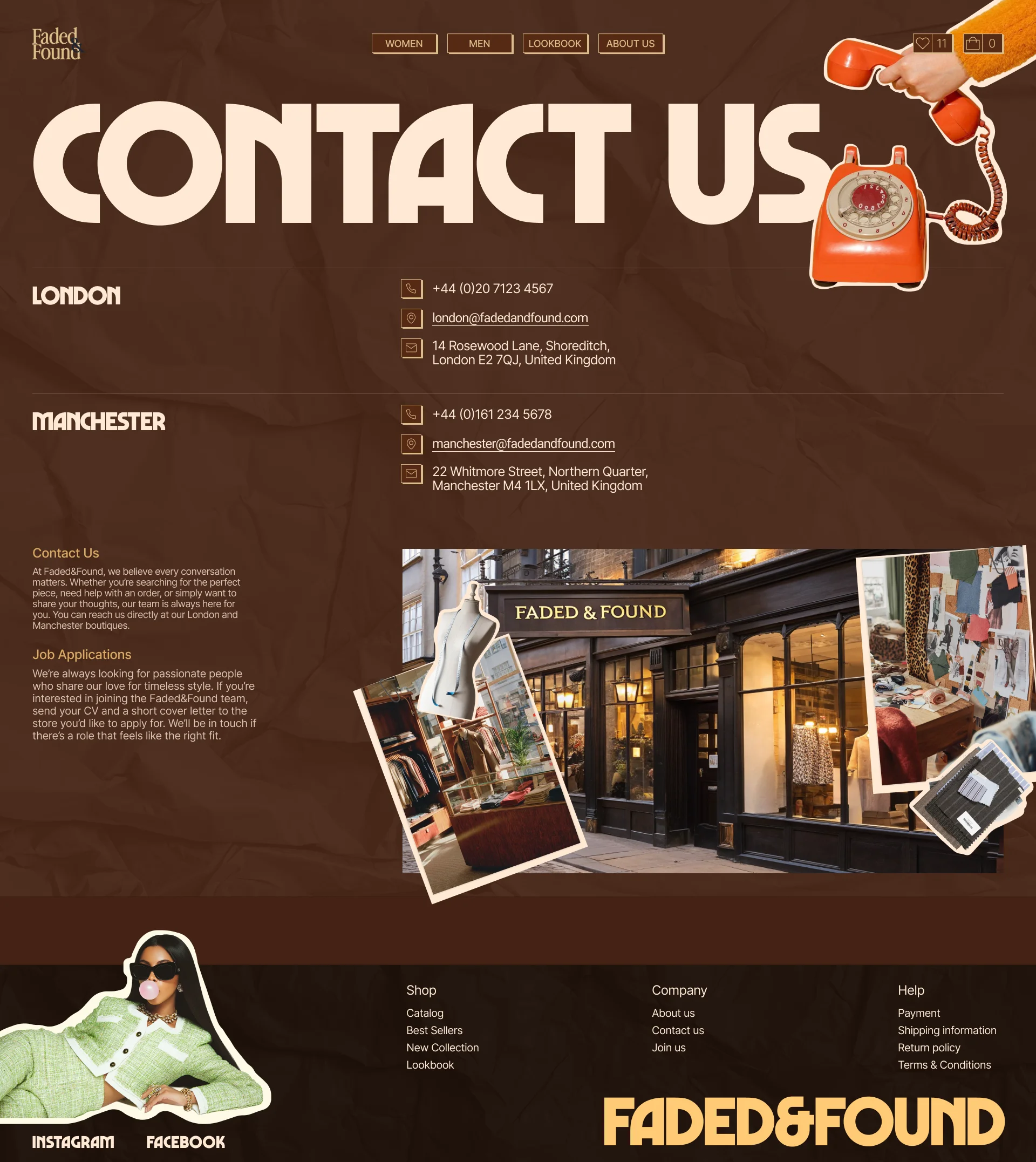
Contact
A shopper finds how to contact the store.
Reflection
What I learned
I learned to split a store into two layers. The structure stays as familiar as in any online shop, and the brand’s character goes into the details: retro type, tags on the photos, collage. That way the style can be loud without getting in the way of shopping.
What I’d improve
The store ships worldwide, so I’d add a language and currency switch to the header. Shoppers abroad could then read the store in their own language and see prices in their own currency.
Next steps
Next, I’d test the shopping flow with people from the brand’s audience: can they find a piece in their size and reach checkout without getting lost in the magazine style?