UpToDate
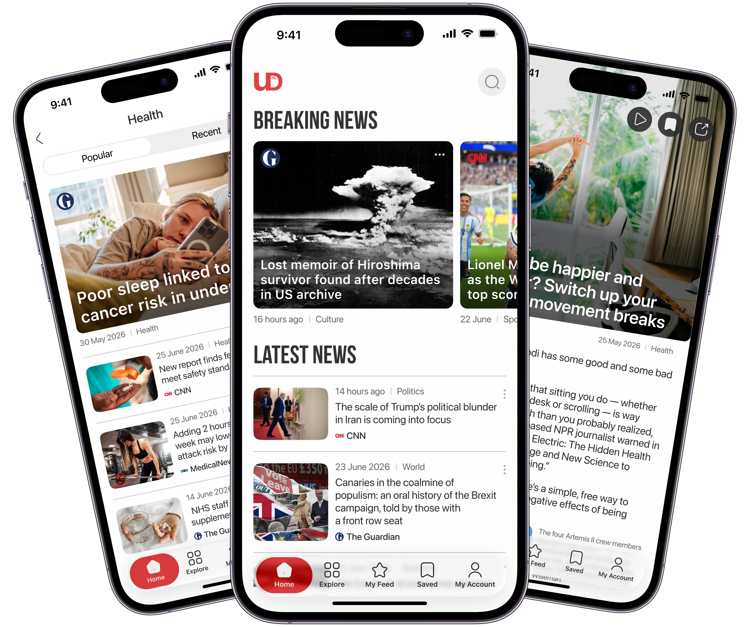
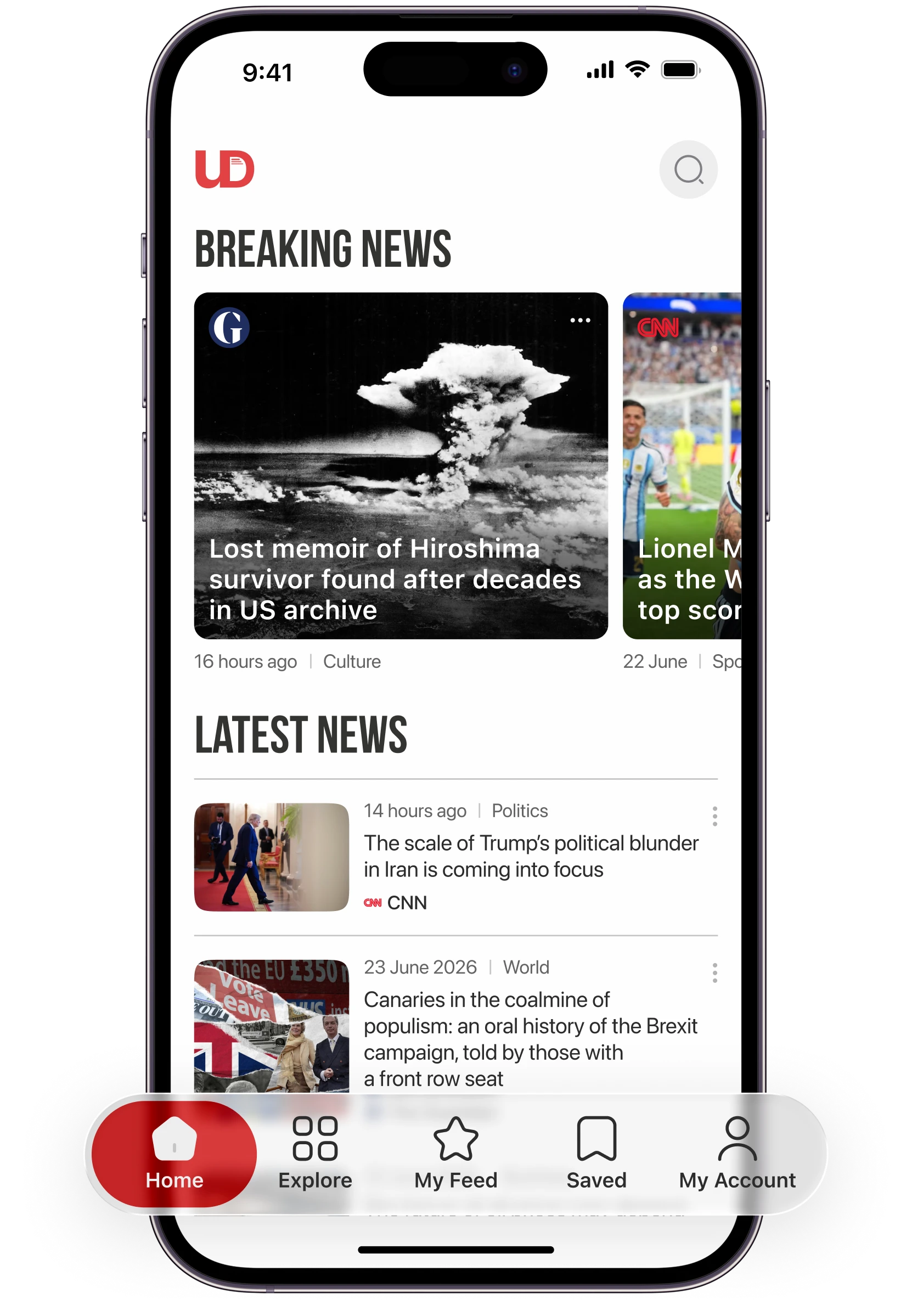
A personalized news app designed with a minimal interface to help people stay informed without information overload.
- Concept project
- Product Designer
- Figma
- 2026
Problem & goal
The problem
People want to stay informed throughout the day without much effort. But cluttered, confusing interfaces make relevant news hard to find, and it is not always clear whether a source can be trusted.
The goal
Help them reach relevant news quickly and from sources they can trust, with a feed shaped by their interests, simple ways to find and save stories, and navigation that stays out of the way.
Key decisions
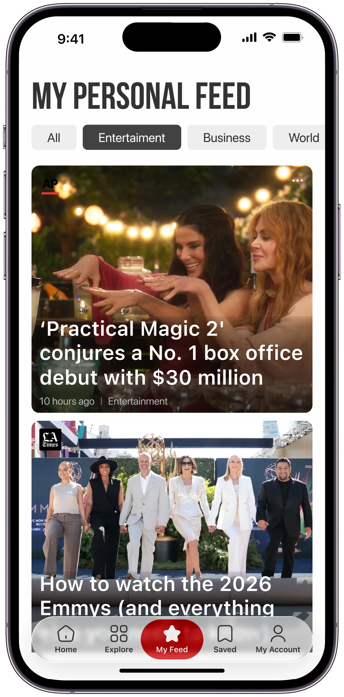
Personalized feed
Search & discovery
Saved
Clear navigation
Process
Research
Competitive analysis
I compared three news apps on their structure and core features.
Strengths
- Saving content to read later
- Different ways to consume news
- Following topics and categories
- Managing news subscriptions
Weaknesses
- Confusing navigation patterns
- Poorly organized content and features
- Relevant news takes longer to find
- Cluttered interfaces that are hard to scan
These apps already offered plenty of useful features. What they lacked was clear organization. So I focused on three things for UpToDate: a clearer structure, easier ways to discover news, and quick access to relevant content.
Define
Customer journey map
Based on my research, I mapped the user journey. These are the main pain points that shaped the design.
| Stage | User questions | Pain points |
|---|---|---|
| Log in | Do I need an account? | Registration takes too long Unclear benefits of an account |
| Home | Can I quickly find topics I care about? | Irrelevant content Important news is hard to spot |
| Categories | How can I find what I need? | Areas of interest are missing No category structure |
| Article | Is the information trustworthy? | Clickbait Unreliable and outdated information |
| Saved | Where can I find my saved articles? | Saved article is hard to find Article unavailable after saving |
| Subscription | Is the subscription worth the cost? | Unclear pricing Difficult cancellation process |
Ideate
From pain points to screens
I turned the research findings and pain points into solutions for each stage of the journey.
Prototype
Wireframes
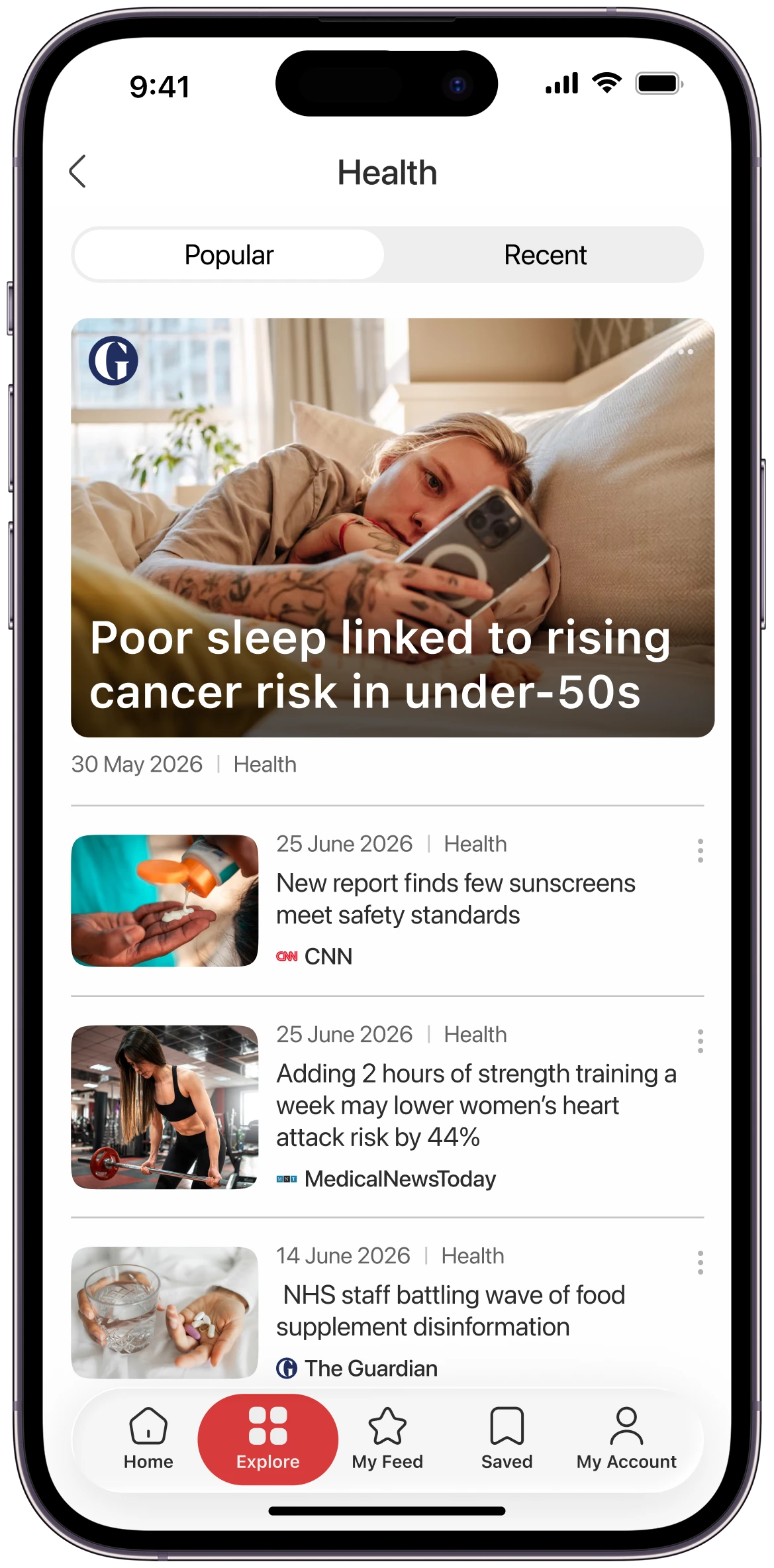
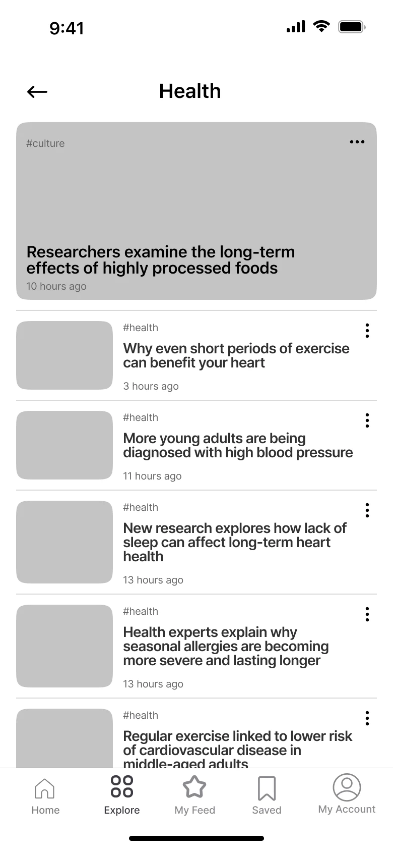
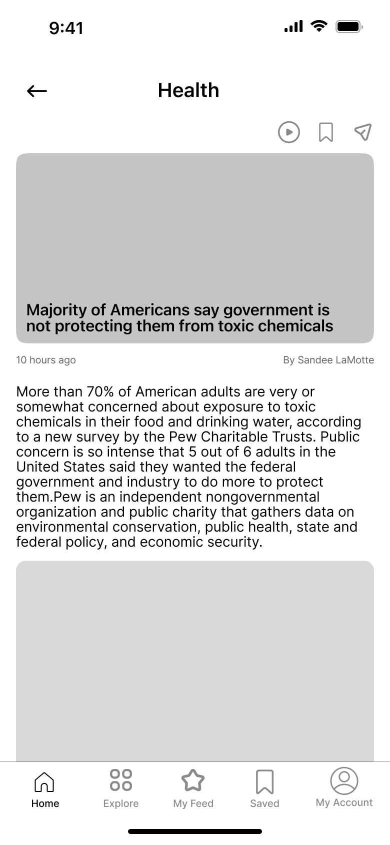
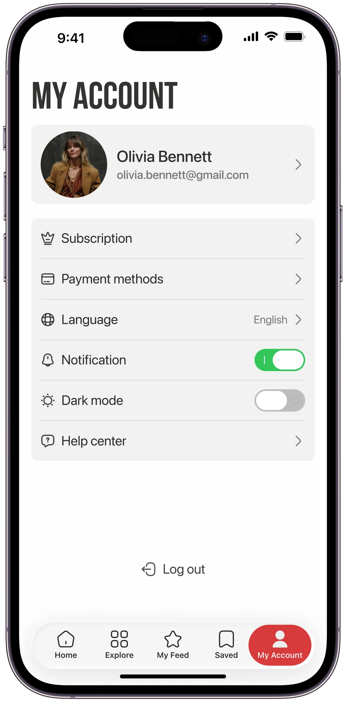
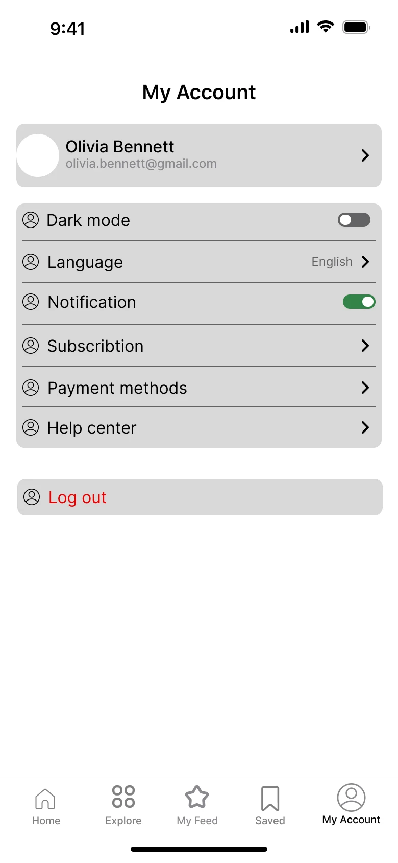
I wireframed the path from login to an article, and the account screen. Switch a screen to Design to see the finished version.
Visual Design
Typography
Colors
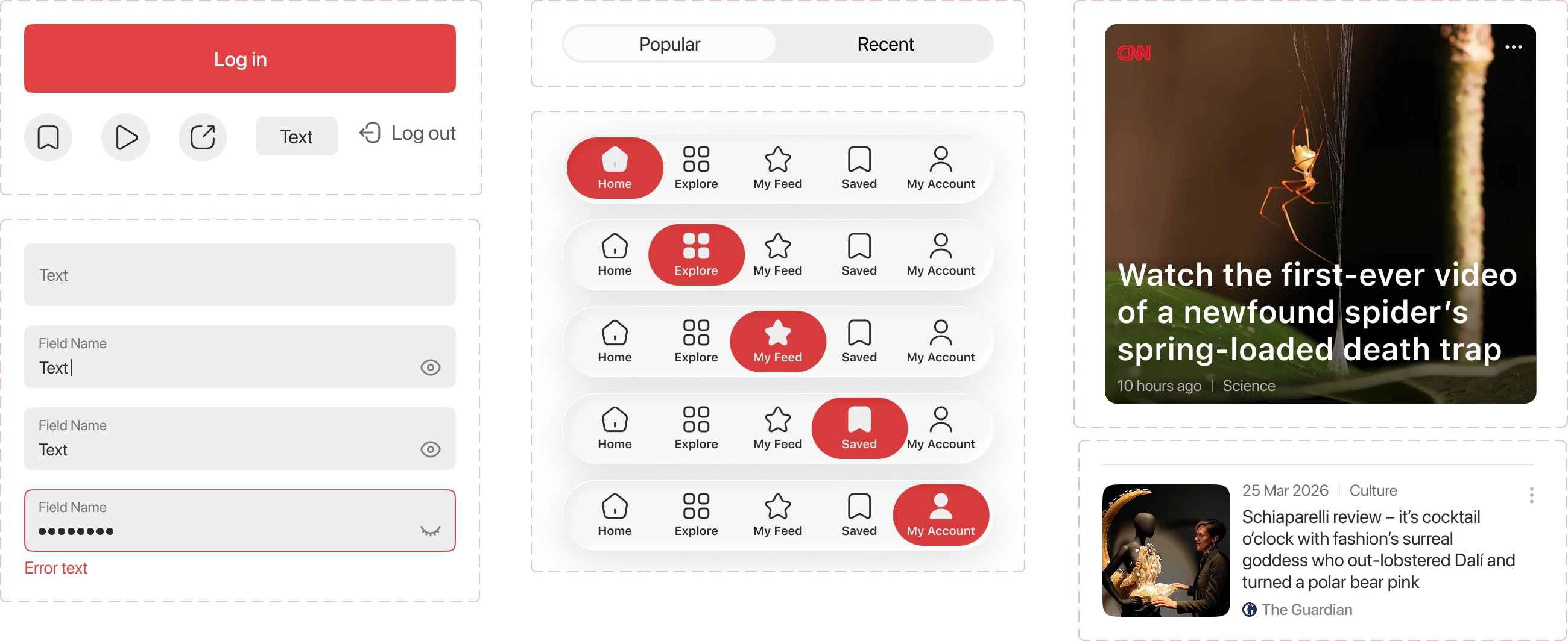
Components


Log in
Registration takes too long
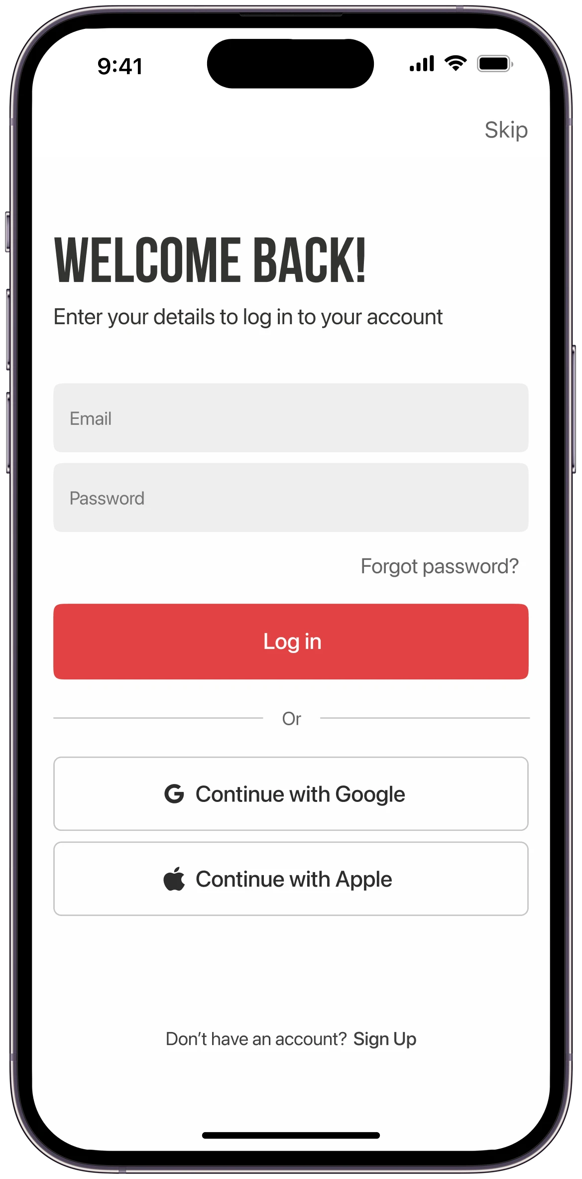 Read news without an accountLog in with Google or Apple
Home
Important news is hard to spot
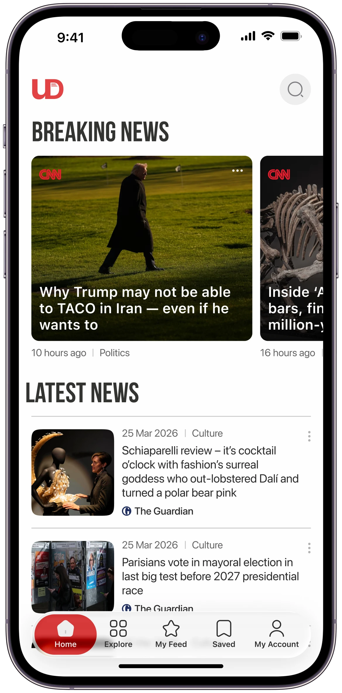 Breaking news at the topLatest news below
Categories
No category structure
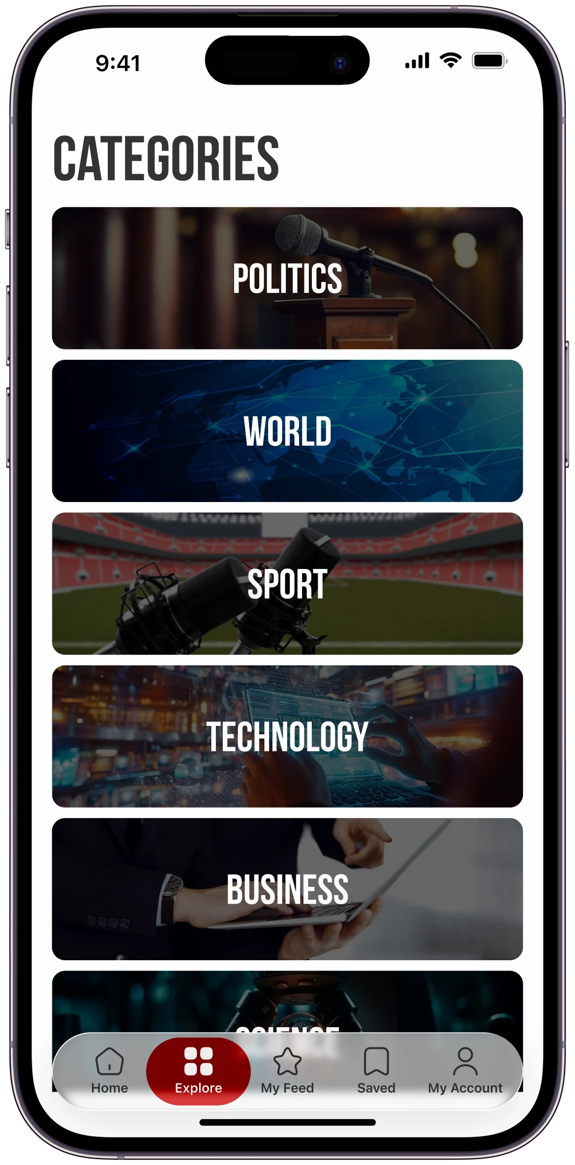 All categories in one list
Article
Unreliable and outdated information
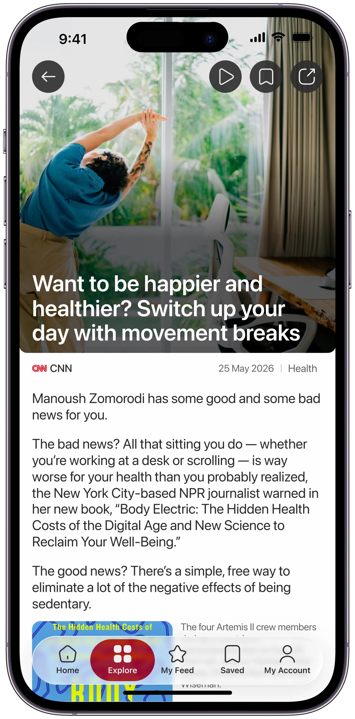 Source and publication date
Saved
Saved article is hard to find
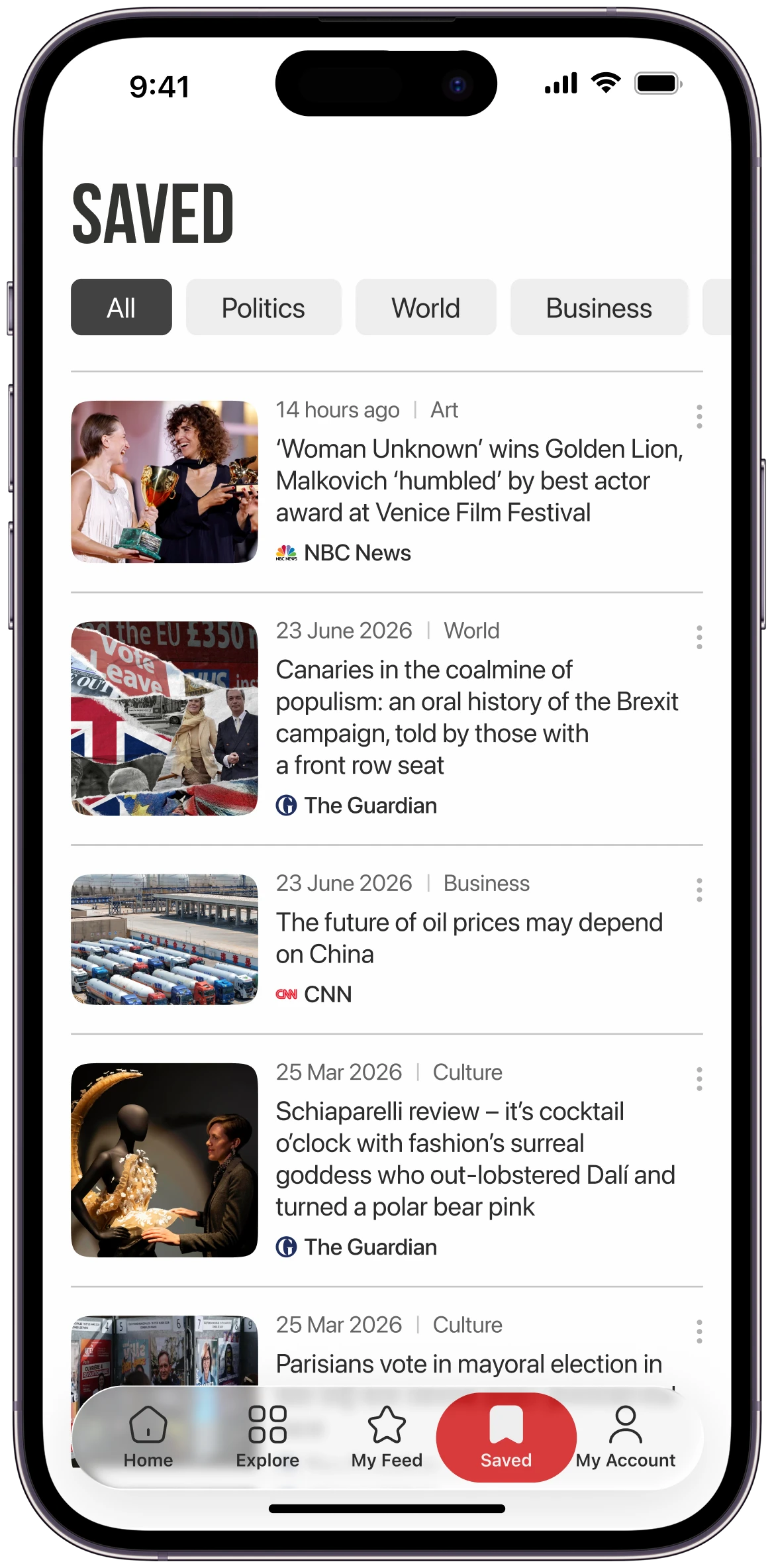
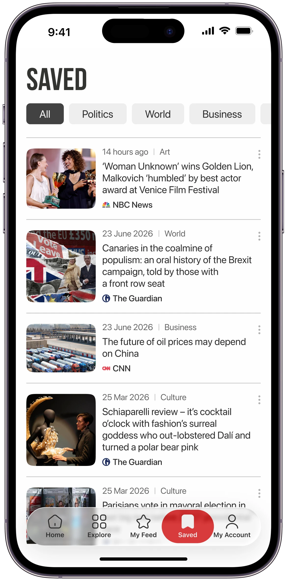 Filter by categorySaved in the tab bar
Subscription
Unclear pricing
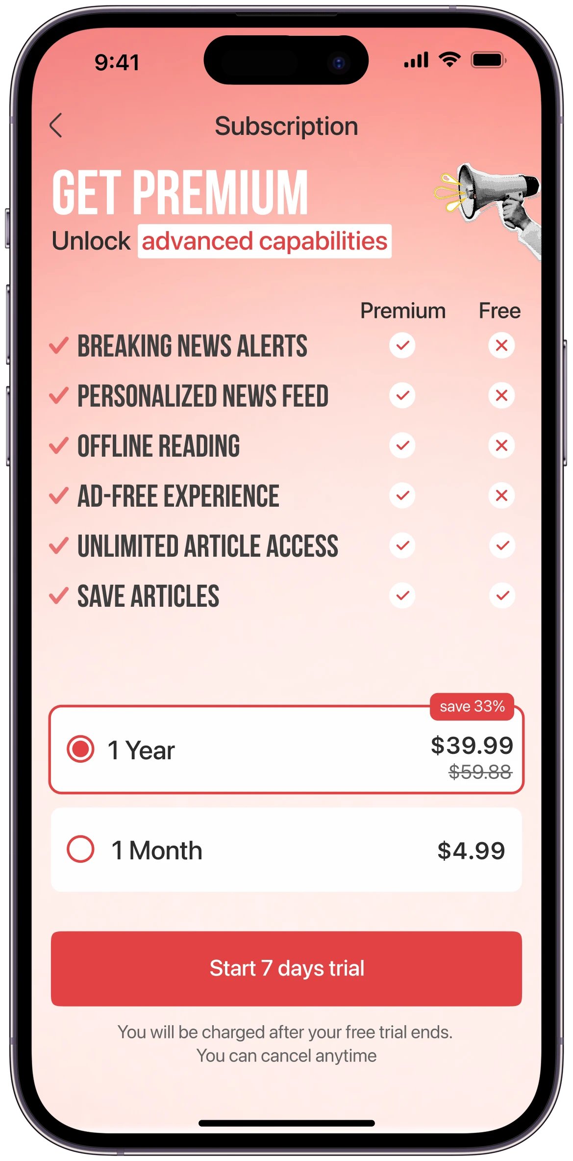 Premium and Free comparedPrice of each plan
Log in
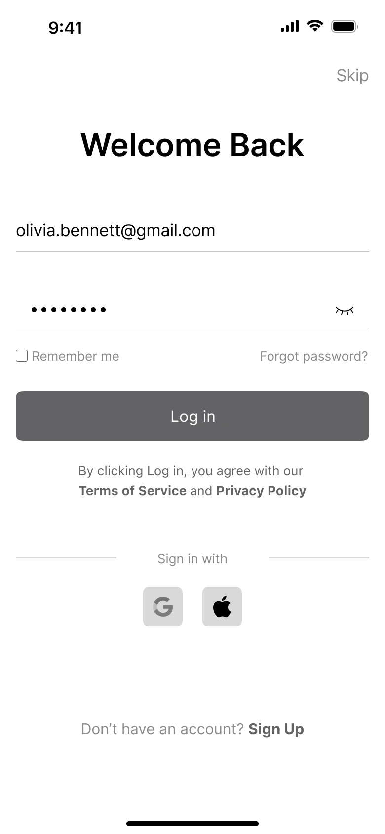
Home
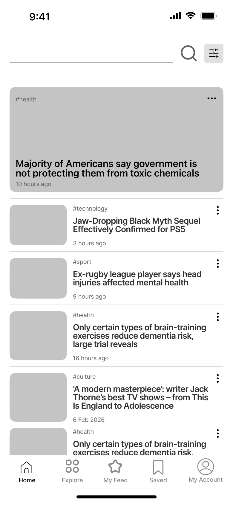
Categories
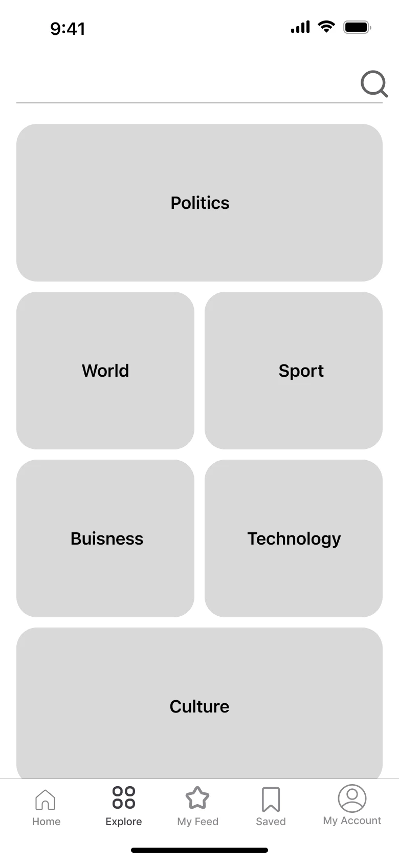
Category feed
Article
Account
Bebas Neue
Headlines
SF Pro Display
Interface & Body
- #2C2C2C
- #2C2C2C at 90%
- #2C2C2C at 70%
- #2C2C2C at 60%
- #2C2C2C at 20%
- #2C2C2C at 10%
- #FFFFFF
- #E14344
Final design
Finding a story
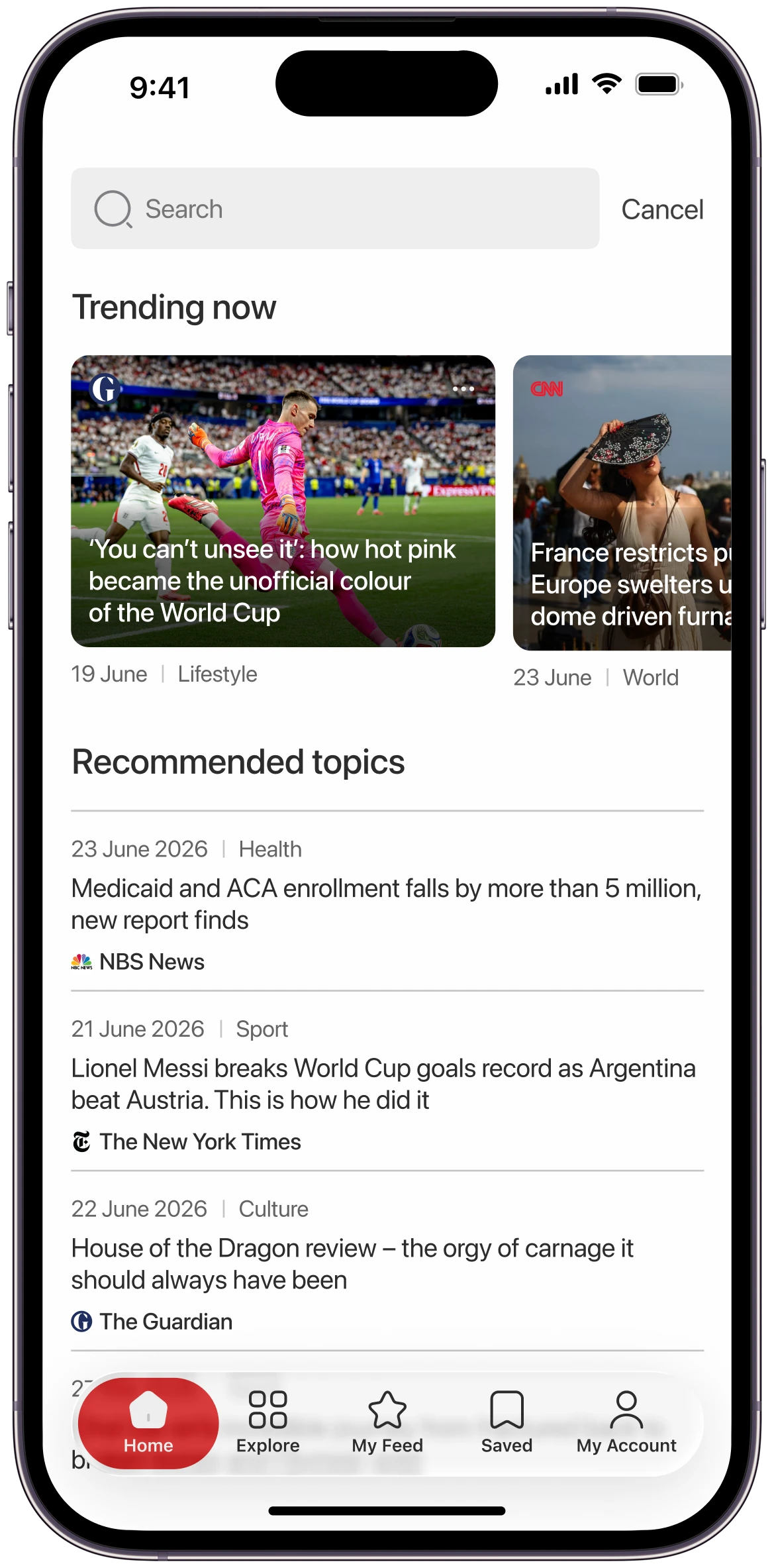
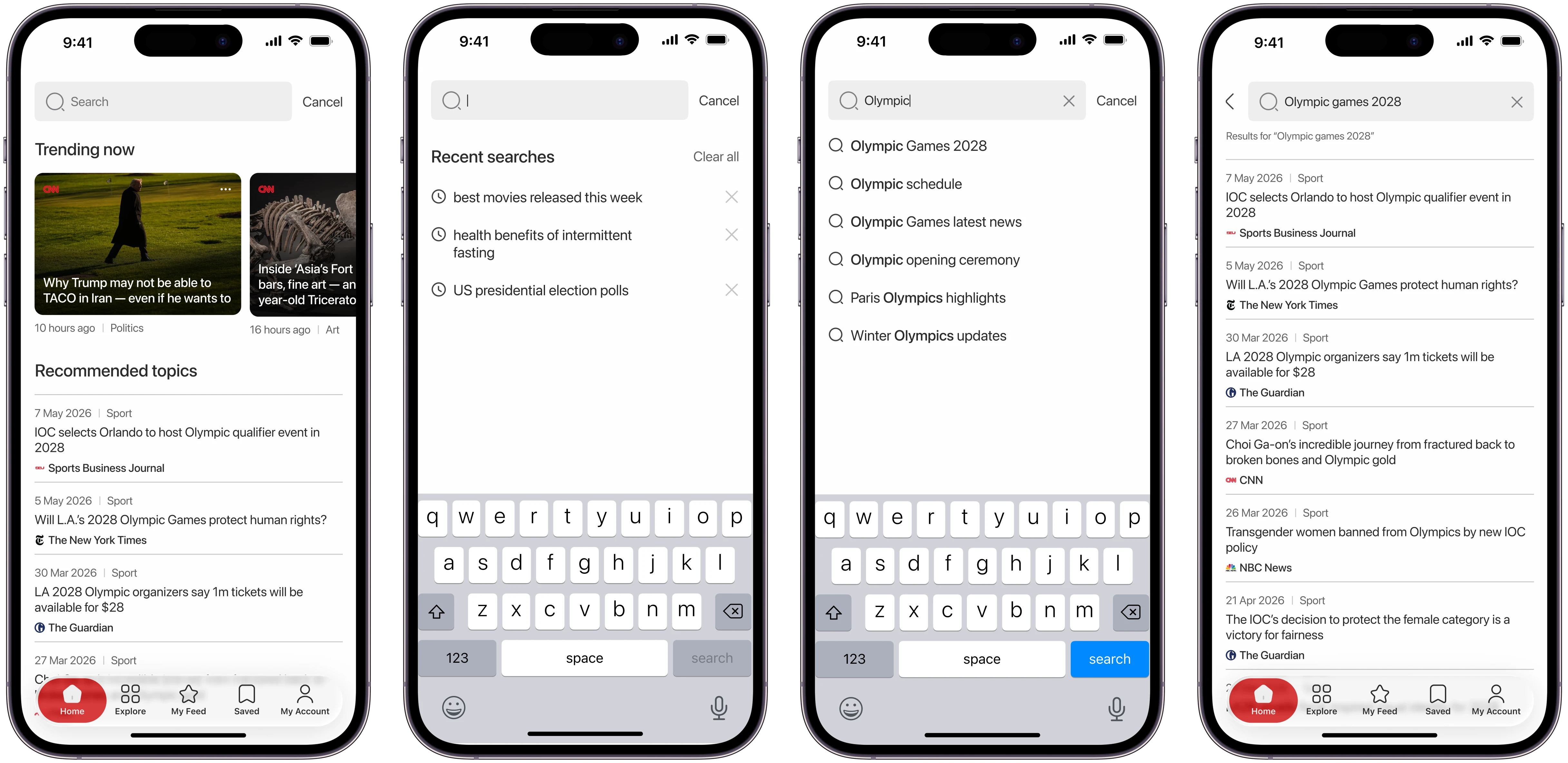
Search opens on trending stories and recommended topics. People see recent searches when they tap the field and suggestions as they type.
Reading
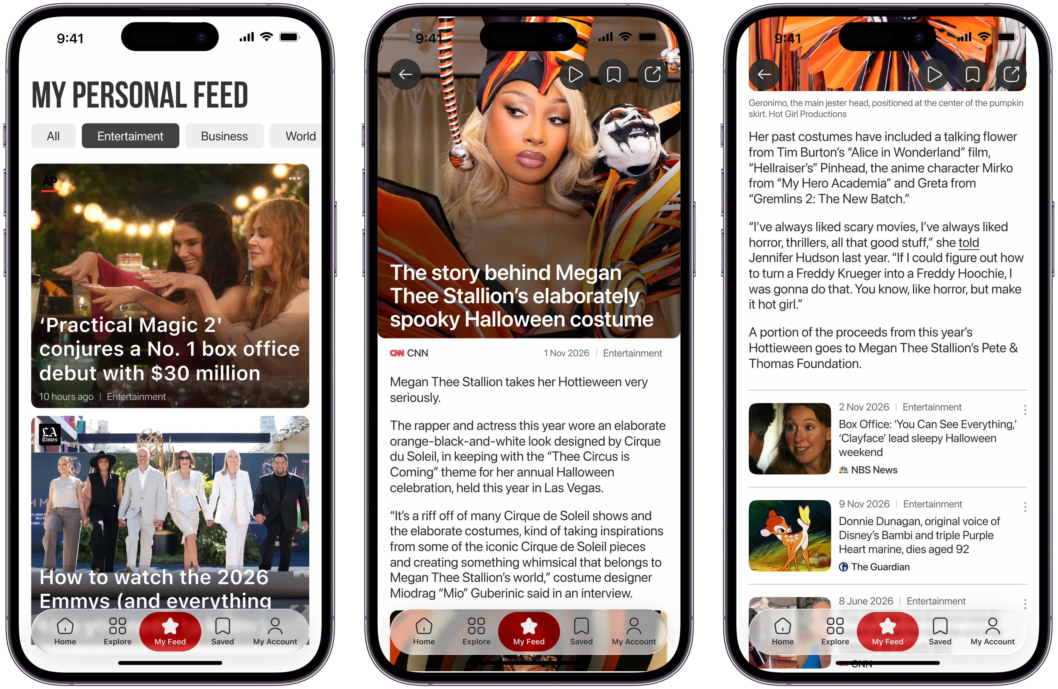
My Feed opens on the stories people read and save, sorted into topic tabs. An article ends with related stories.
Premium & account
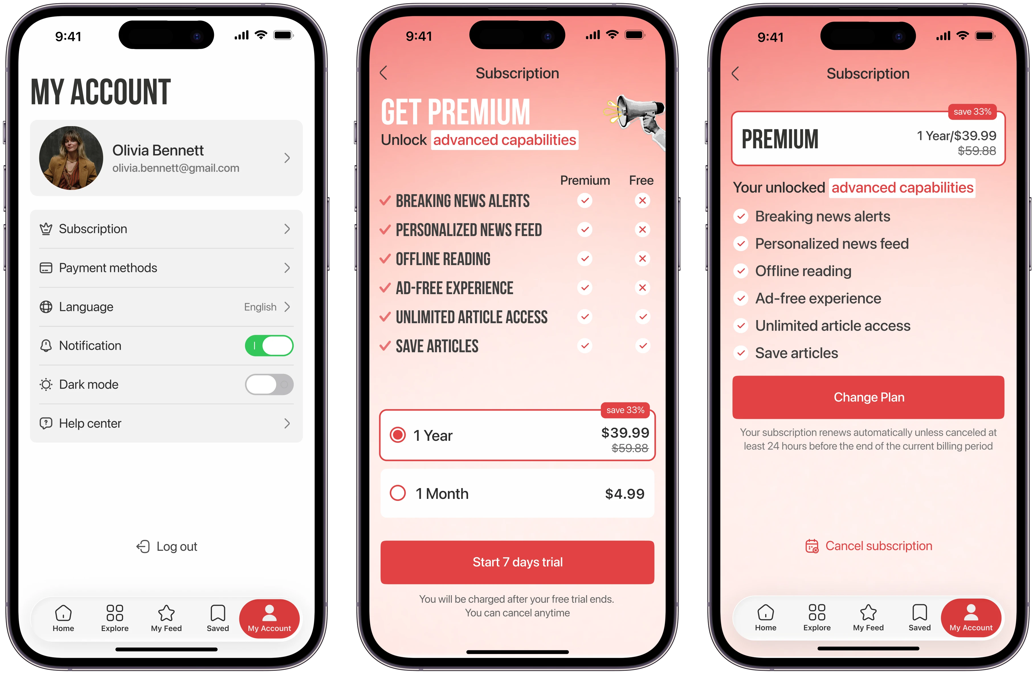
People compare plans and pay in the app, and can cancel the subscription from their account.
Reflection
What I learned
In a news app, the structure and the interface can’t be designed apart. With content that never stops changing, people rely on a clear hierarchy and navigation to find their way. I learned to look past single screens and design the parts of the product as one system.
What I’d improve
My Feed adapts to what people read and save, but I didn’t work out what a new user sees before the app knows their interests. I’d ask new users to pick a few topics on first launch and build their first feed from them.
Next steps
I’d run usability tests on the main flows and the navigation.