Lash Extension Training Course
A landing page that helps Marina Nemtsova sell her lash extension course to beginners.
“Katerina captured my style 100%. She asked so many thoughtful questions and even reworked the colours until they were just perfect.”
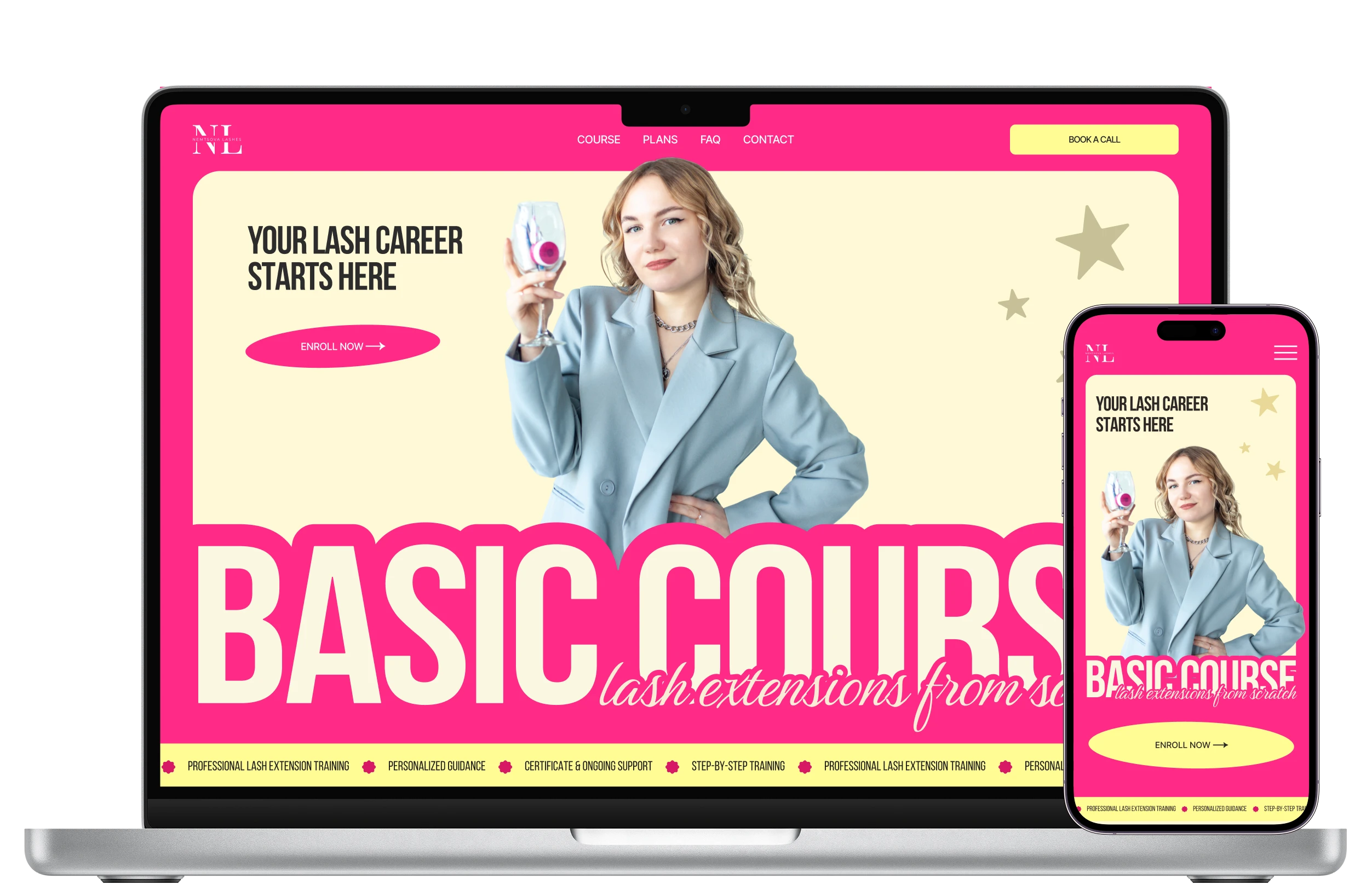
- Client project
- UX/UI Designer
- Figma
- 2026
- Delivered & approved by the client
Project brief

The client
Marina Nemtsova is a lash artist and trainer who needed a landing page to promote her lash extension training course and attract new students.
The brief
The client asked for a page that presents her course and shows her experience, so that new students choose to enroll.
Client requirements
Business goal
- Promote and sell the training course
Key selling points
- Experienced instructor
- Practical training with models
- Certificate of completion
- Ongoing instructor support
- 20% discount on materials
Visual direction
- Stylish
- Airy
- Bright
- Aesthetic
Preferred colors
- Pink
- Yellow
- White
- Gray
- Black
Problem & goal
The problem
The course had strong selling points, but no single page showed them together and gave people a reason to trust the trainer.
The goal
Design a page that earns visitors’ trust and leads them to the application form.
Key decisions
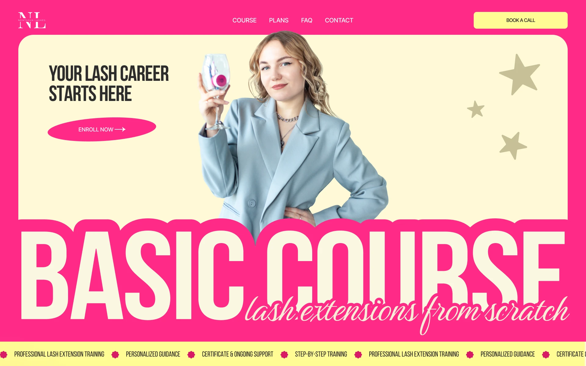
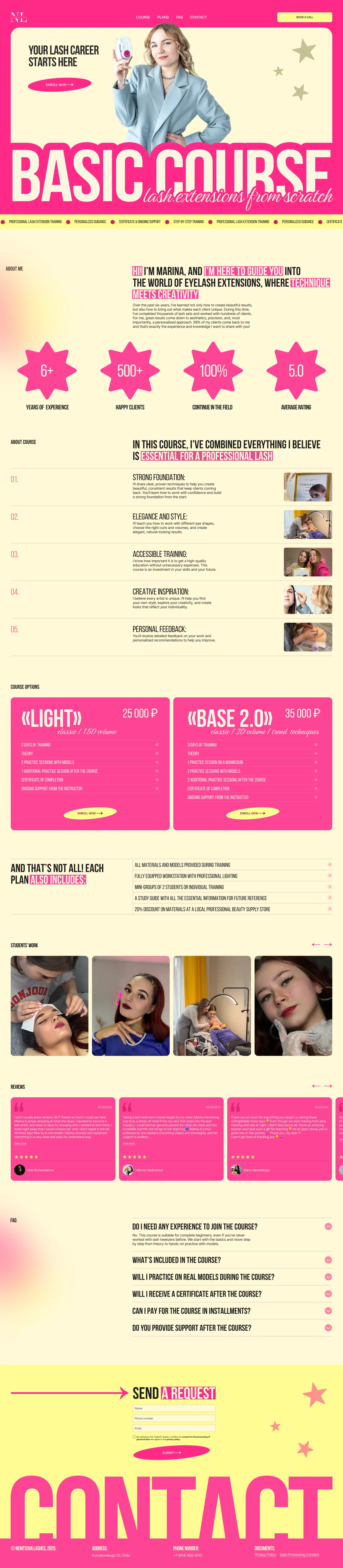
Modern design choices, such as bold condensed type and a bright color palette, make the course look active from the first screen.
“An outdated website makes it unclear whether the course is still active”
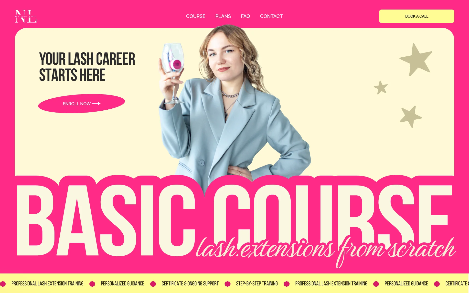
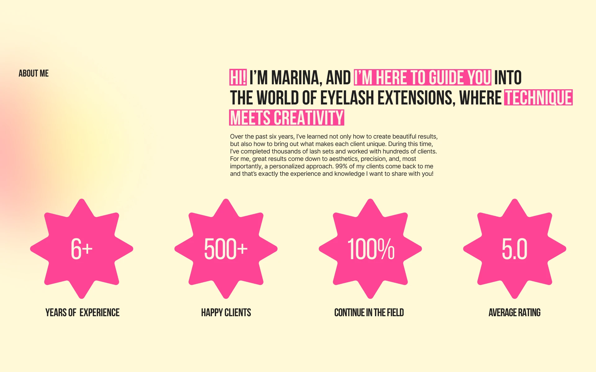
A short introduction from the client comes first, and the facts that matter most follow in large numbers.
“Detailed information about the instructor builds trust”
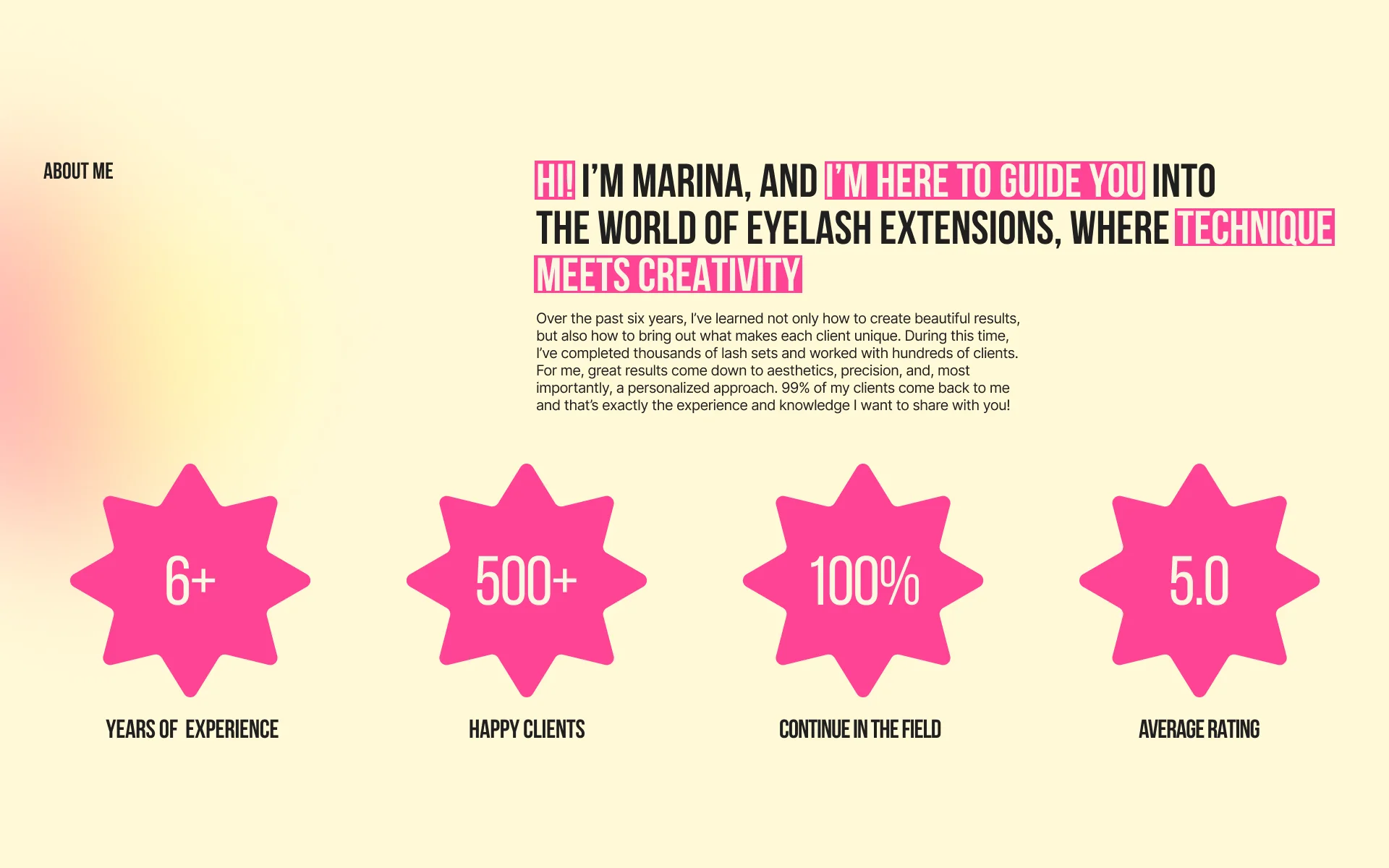
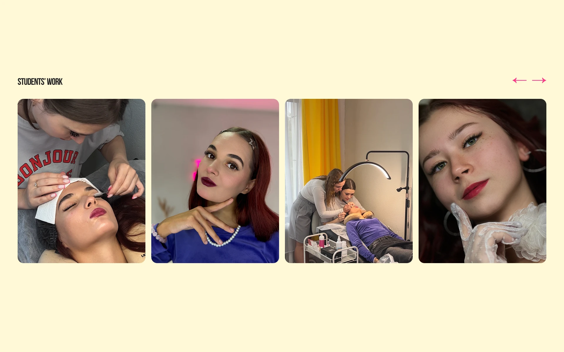
Photos from the course show students working on models and the lashes they finished.
“Real photos of the training process show that the course is genuine”
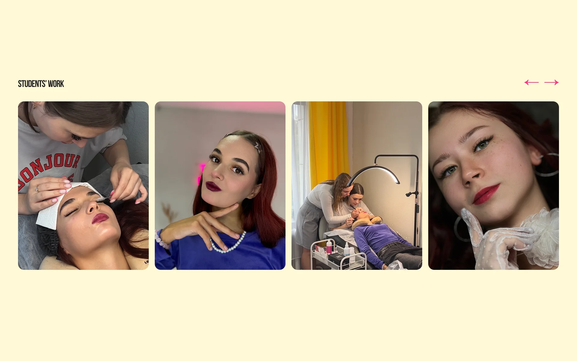
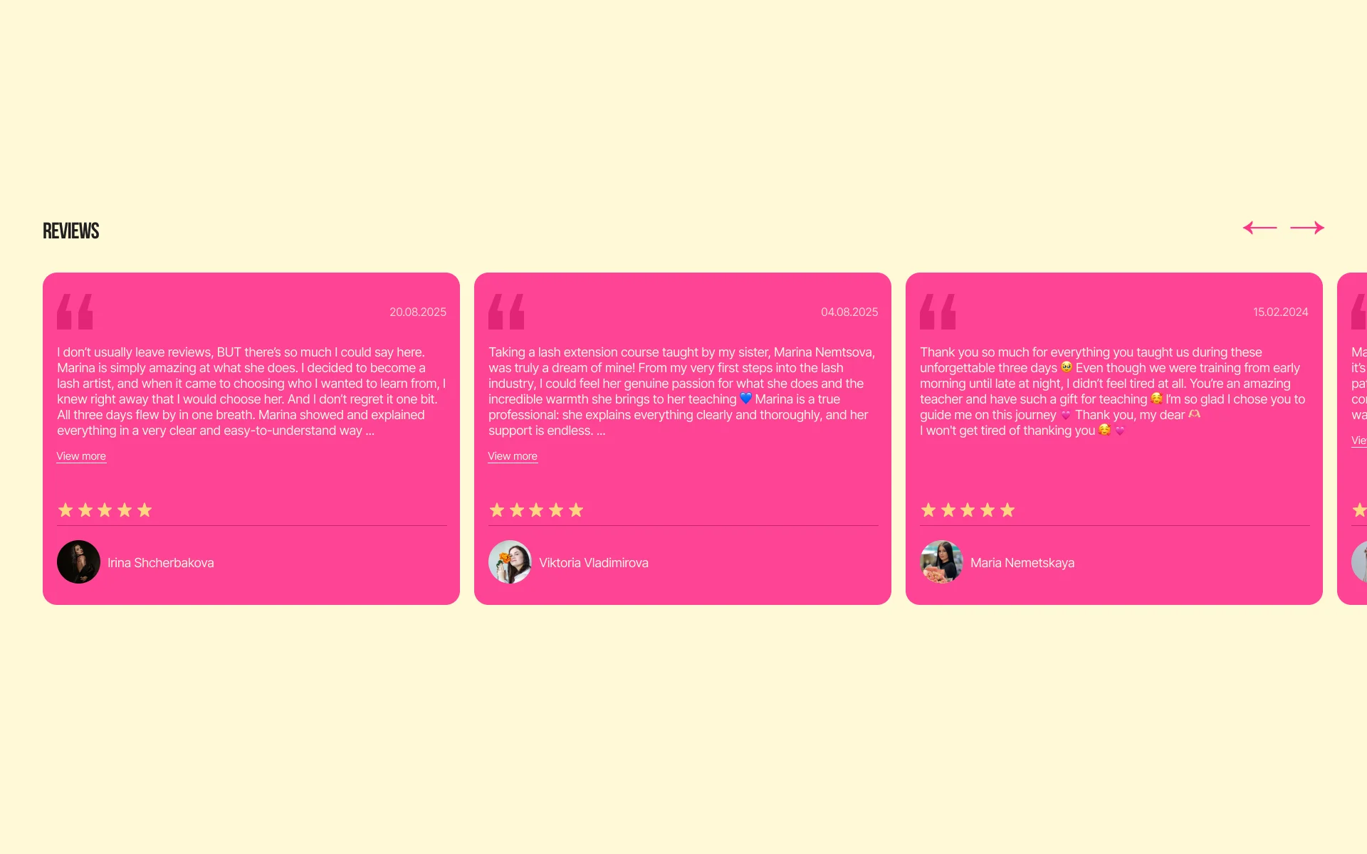
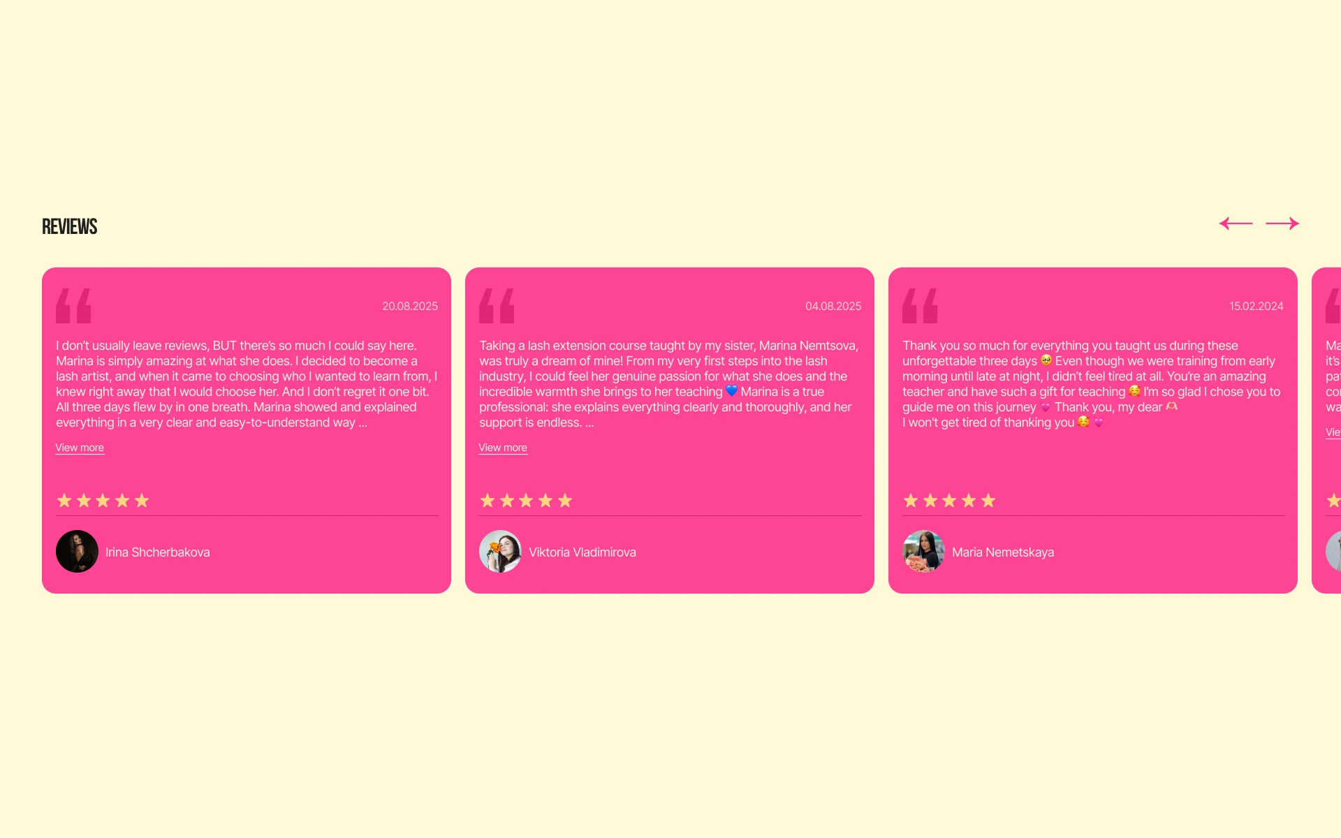
Each review comes with the student’s name and photo, so future students see a real person behind the words.
“Reviews from past students serve as social proof”
Process
Research
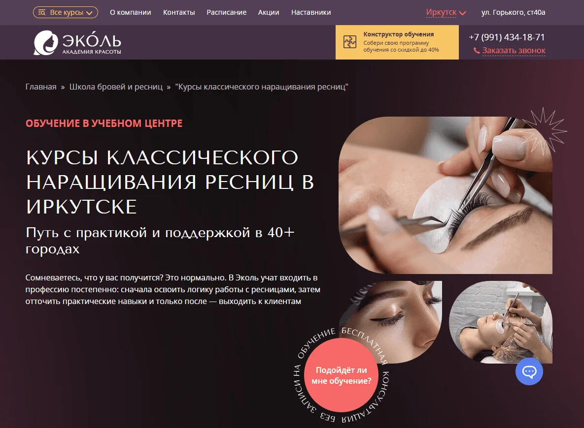
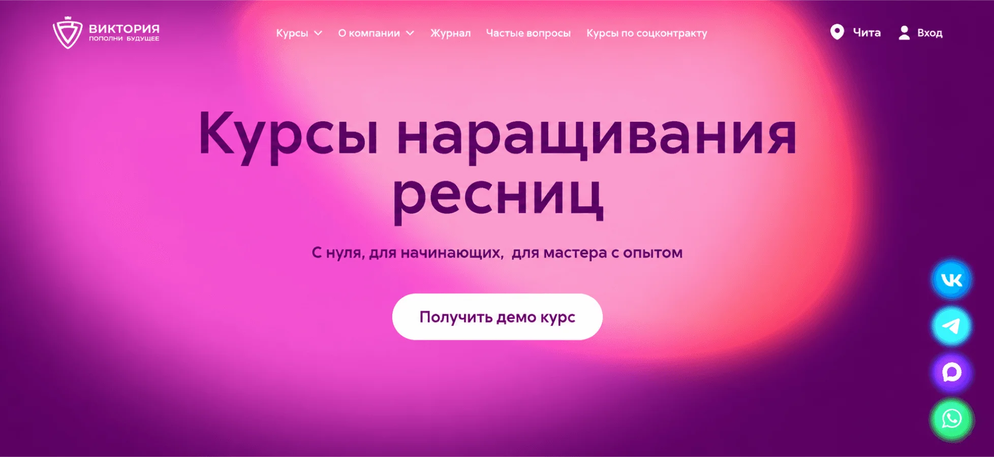
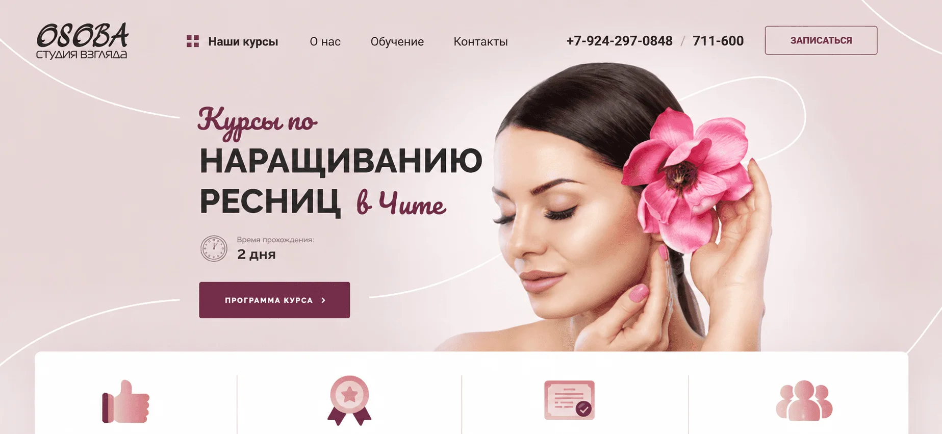
Competitive analysis
I analyzed three local lash extension training websites to see how they present their courses and what makes a visitor trust them.
What worked
- Detailed information about courses and instructors helped build trust
- Real photos of the training process showed that the courses were genuine
- Certificates, student work, and reviews provided social proof
- Course benefits and training options were clearly presented
- Contact details and application forms were easy to find
What didn’t work
- Information was hard to scan, and key details were difficult to find
- Some websites looked outdated, making it unclear whether the courses were still active
- Some websites looked careless and full of mistakes, which didn’t match the high price of the course
The sites that built trust showed real photos, student work and reviews. The weaker ones looked dated, and their information was hard to find. This led me to two priorities: a clear page structure and a modern look that shows the course is active.
Structure
Page structure
I ordered the sections from the research findings and the client’s requirements, as the path a future student takes from first look to application.
Prototype
Wireframes
Visual Design
Visual style
The style grew out of the client’s existing identity: her pink and yellow, with bold condensed headlines. We reworked the palette together until it felt right to her. White became a soft cream, and a deep wine was added for details that need contrast on pink, like thin lines.
Typography
Colors
Course introduction
- HeaderLogo, navigation, CTA
- HeroMain offer, key message, CTA
- About the trainerExperience, approach, credibility
- Course benefitsKey benefits, reasons to enroll
Plans
- Training plansCourse options, pricing
- Additional benefitsExtra benefits included with every plan
Student experience
- Student workExamples of students’ results
- ReviewsStudent feedback
Questions & application
- FAQCommon questions and answers
- ApplicationCourse application form
- ContactsContact details
First pass

Second pass
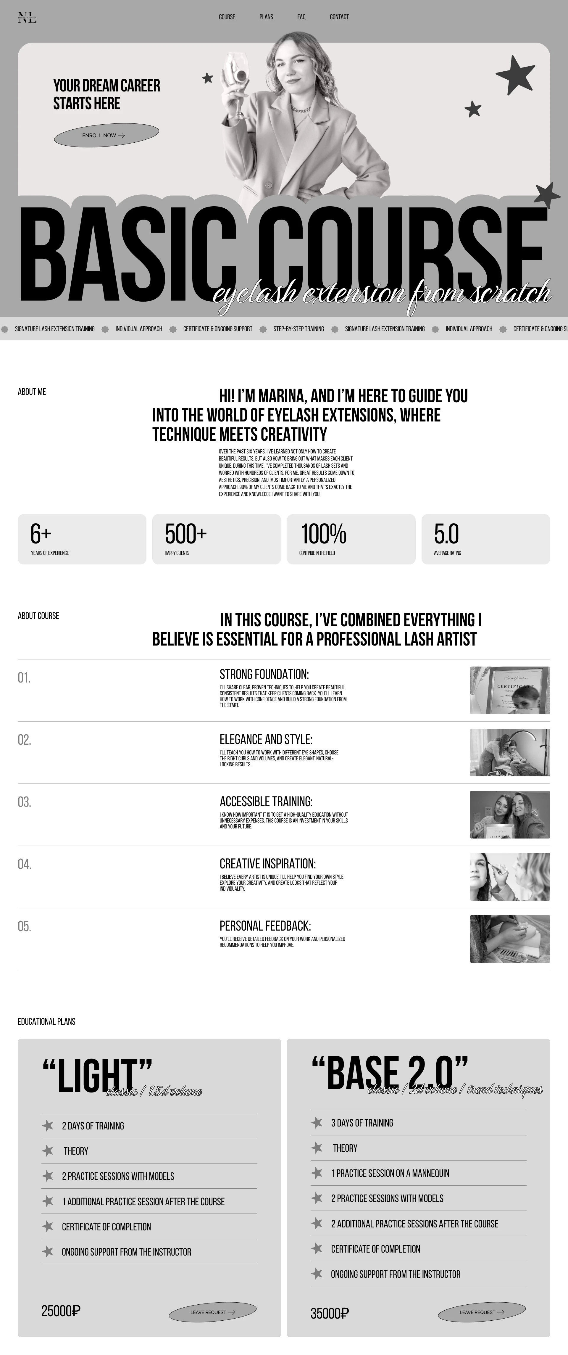
Final wireframe
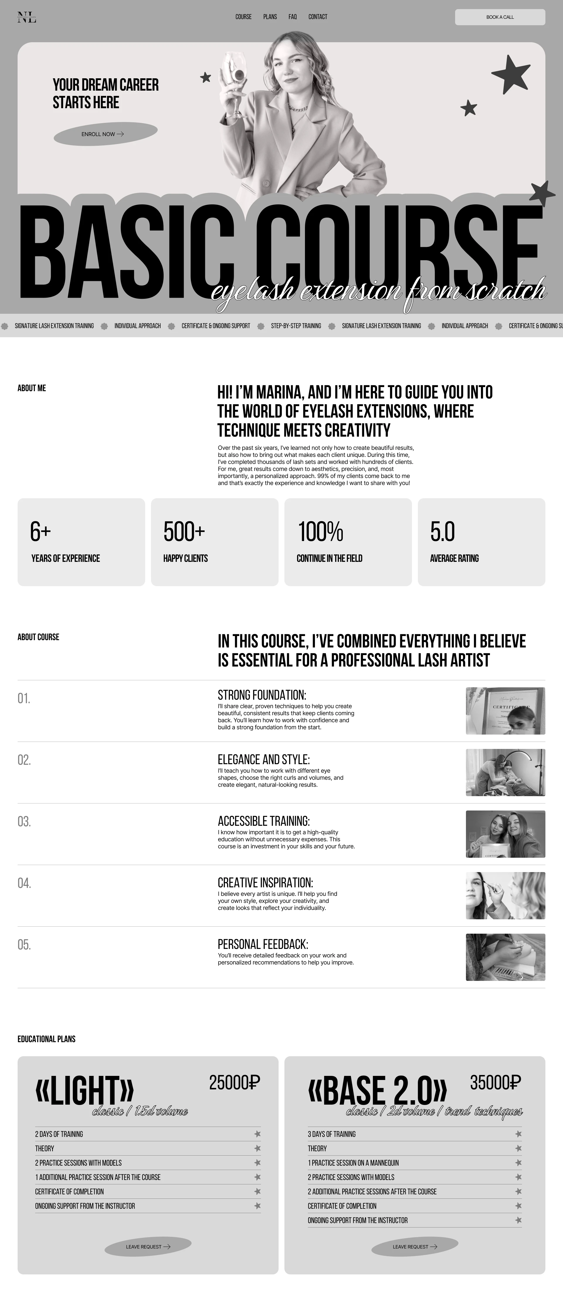
- Bebas NeueHeadlines: bold and modern
- InterBody text: easy to read
Final design



Client feedback
“Everything is so clear, well-structured and incredibly beautiful. Katerina captured my style 100%. The design suits me perfectly! She asked so many thoughtful questions to get everything right, and even reworked the colours until they were just perfect. I'm already in love with the result!”
Reflection
What I learned
Working with a real client taught me to ask questions early and listen closely. The client had a strong style of her own, and we reworked the palette together until it felt right to her. I learned to keep a client’s style and still make the page easy to read.
What I’d improve
Looking back, I would add subtle interactions and animations to make the landing page more engaging.
Next steps
Next, I would test the page with people who are thinking about the course: can they find the plans and the application form without help? What they stumble on would shape the next version.