Moss Space
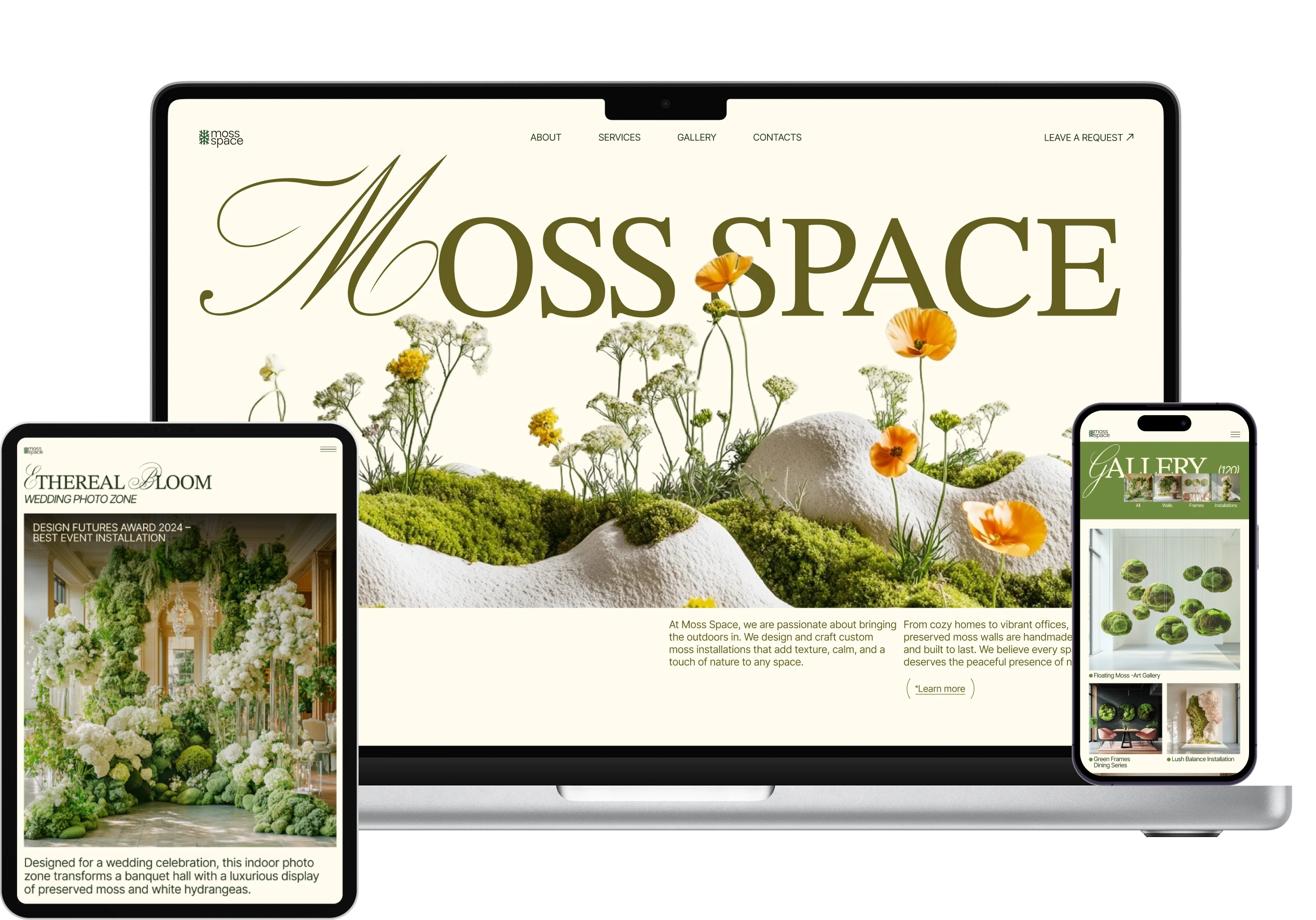
A multi-page website for a London studio that makes custom walls, art pieces and installations from preserved moss.
- Concept project
- UX/UI Designer
- Figma, Midjourney
- 2025
Project brief
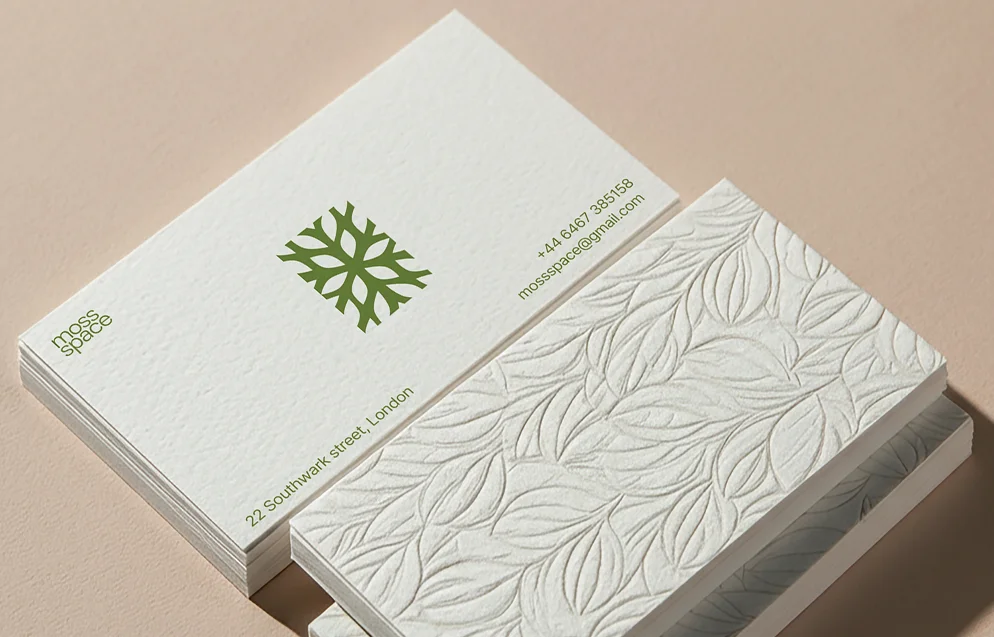
The studio
Moss Space is a design studio I invented for this project. I wrote its brief the way a client would fill one in.
The brief
The studio makes preserved-moss decor for homes, offices, restaurants and hotels. It asked for a website that shows its work and brings in requests for custom projects.
Key selling points
- Creative thinking
- A personal approach
- Quality materials only
- A guarantee on the work
Visual direction
- Stylish and minimalist
- Natural accents
- Shades of green
What customers need
- A cosy space that feels alive
- Eco-friendly materials
- A wow effect
- Greenery without plant care
Problem & goal
The problem
The studio wanted a stylish, minimalist website that brings in requests. Before ordering a custom piece, customers want to see plenty of past projects and reviews. That much proof can crowd a minimalist page.
The goal
A visitor feels the studio’s style from the first screen and finds enough proof to leave a request. The pages keep their minimalist look with all that proof on them.
Key decisions
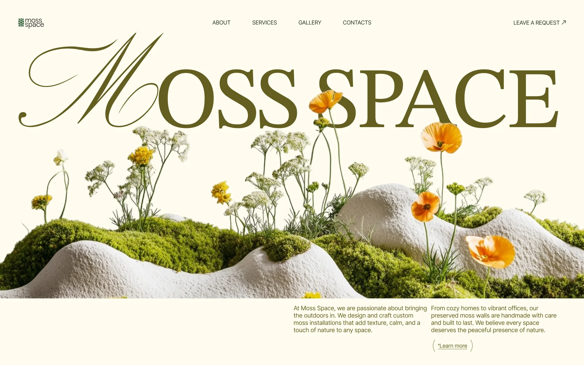
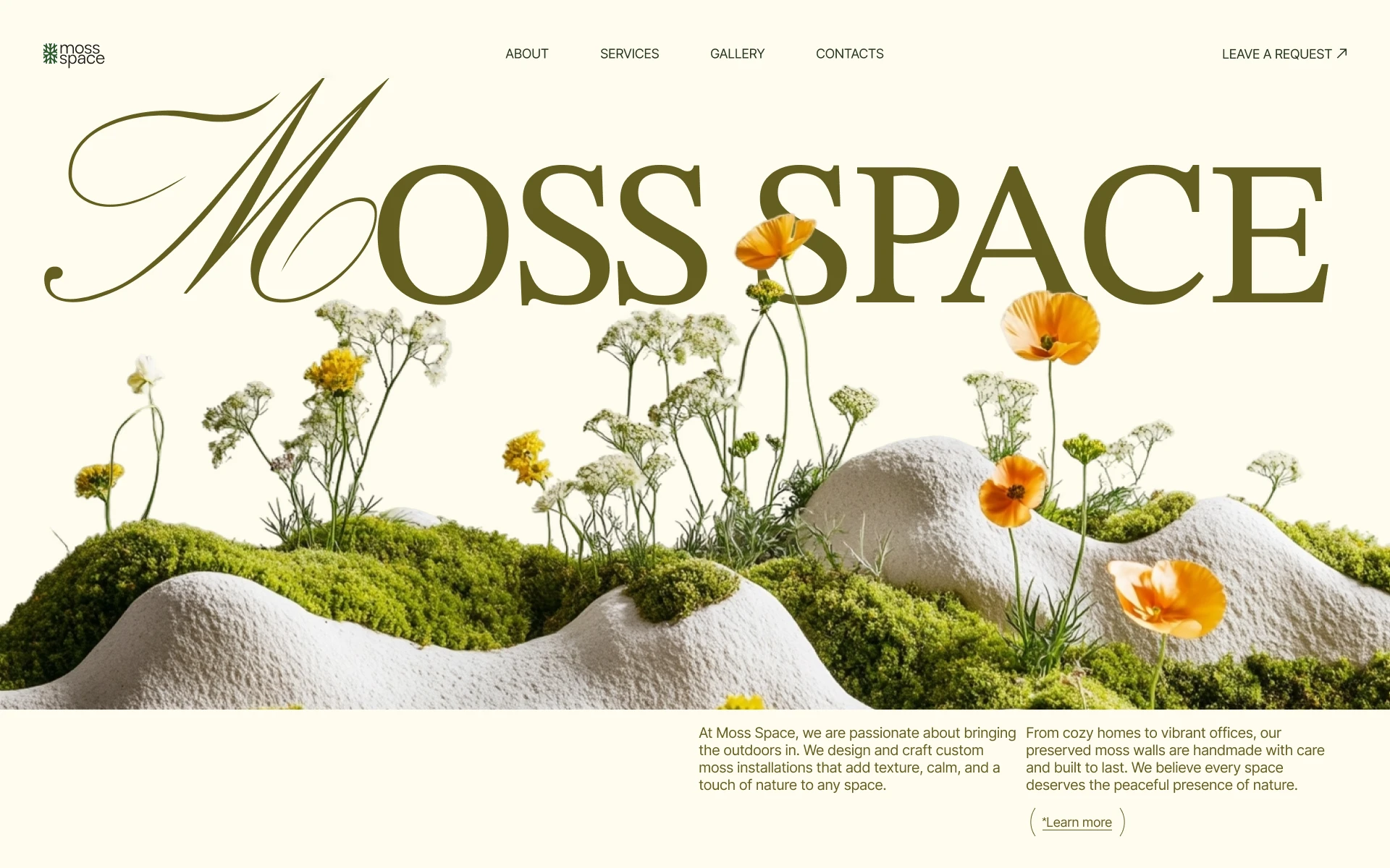
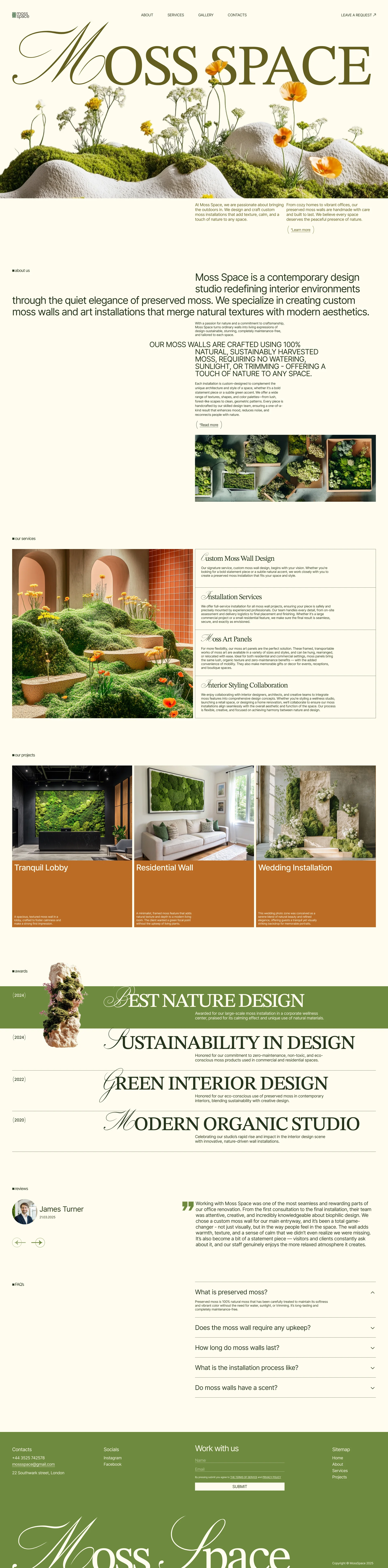
Large serif headings with script initials sit over cut-out moss compositions. Wide margins of cream background keep the page minimalist.
“The studio with more proof looks less refined”
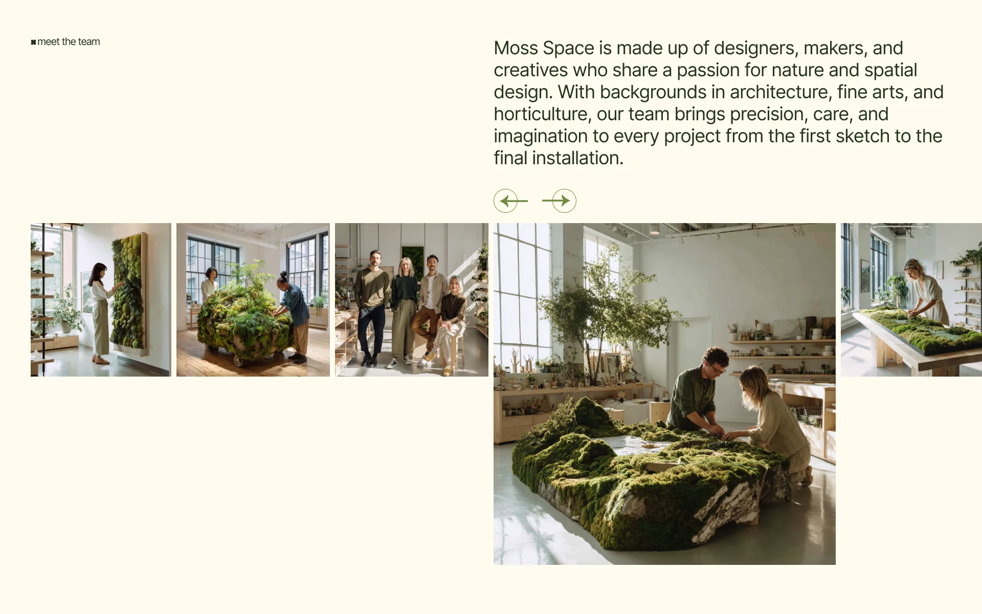
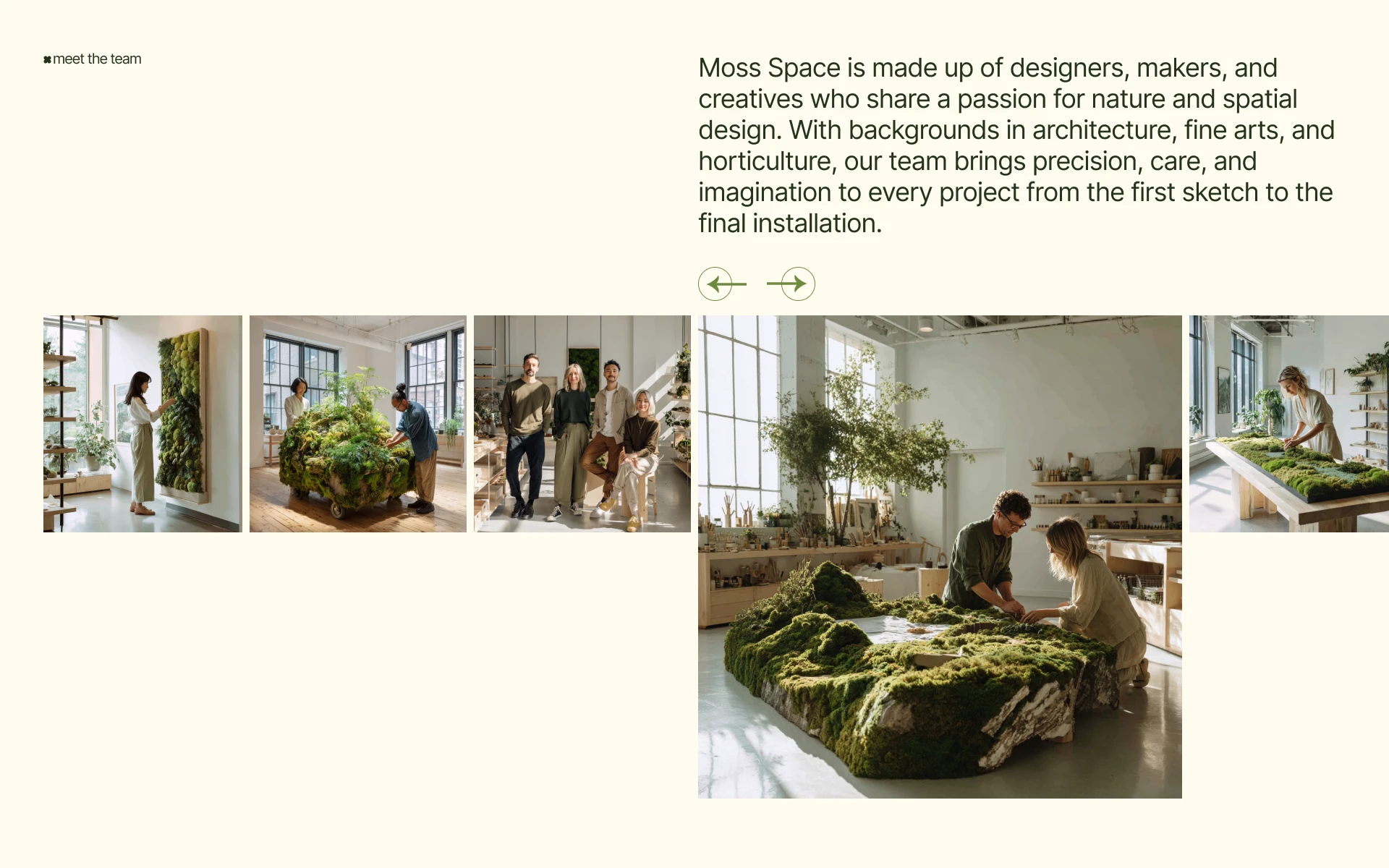
I spread the proof across the site, so no page has to carry all of it. On About, it is the team at work, with a short note on their backgrounds.
“Neither studio shows its team”
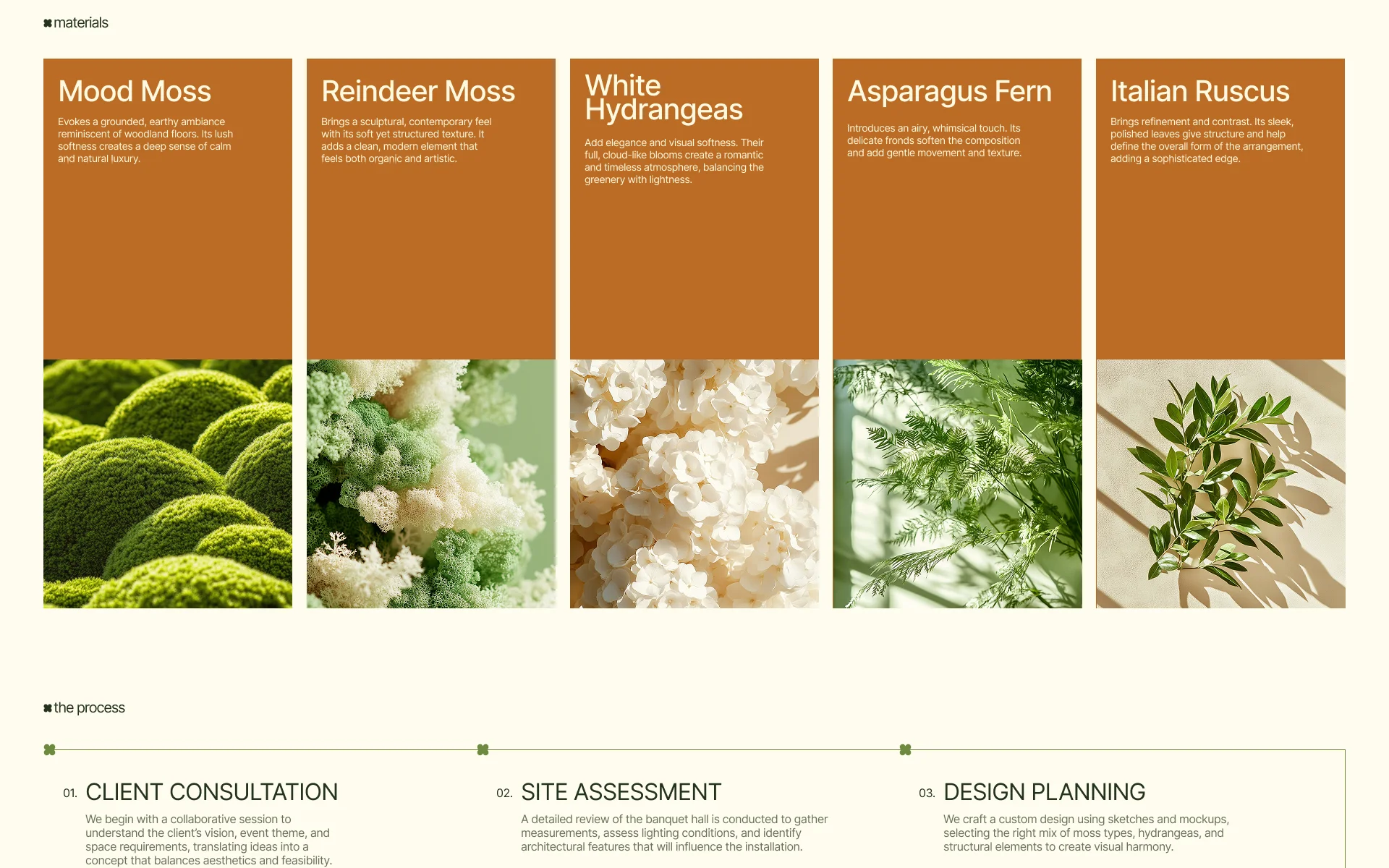
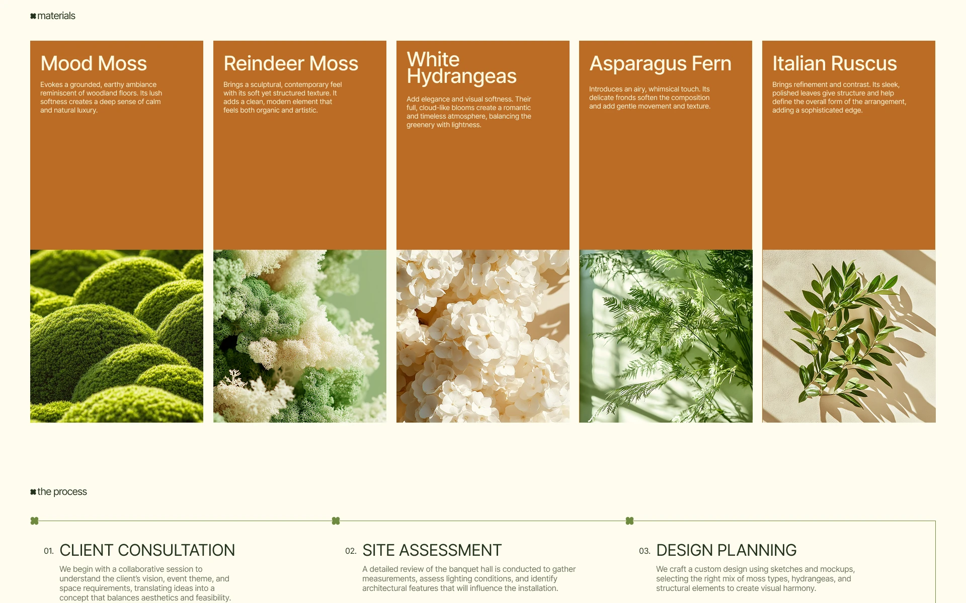
A future customer follows a finished project from its natural materials through the seven steps of the work to the customer’s review.
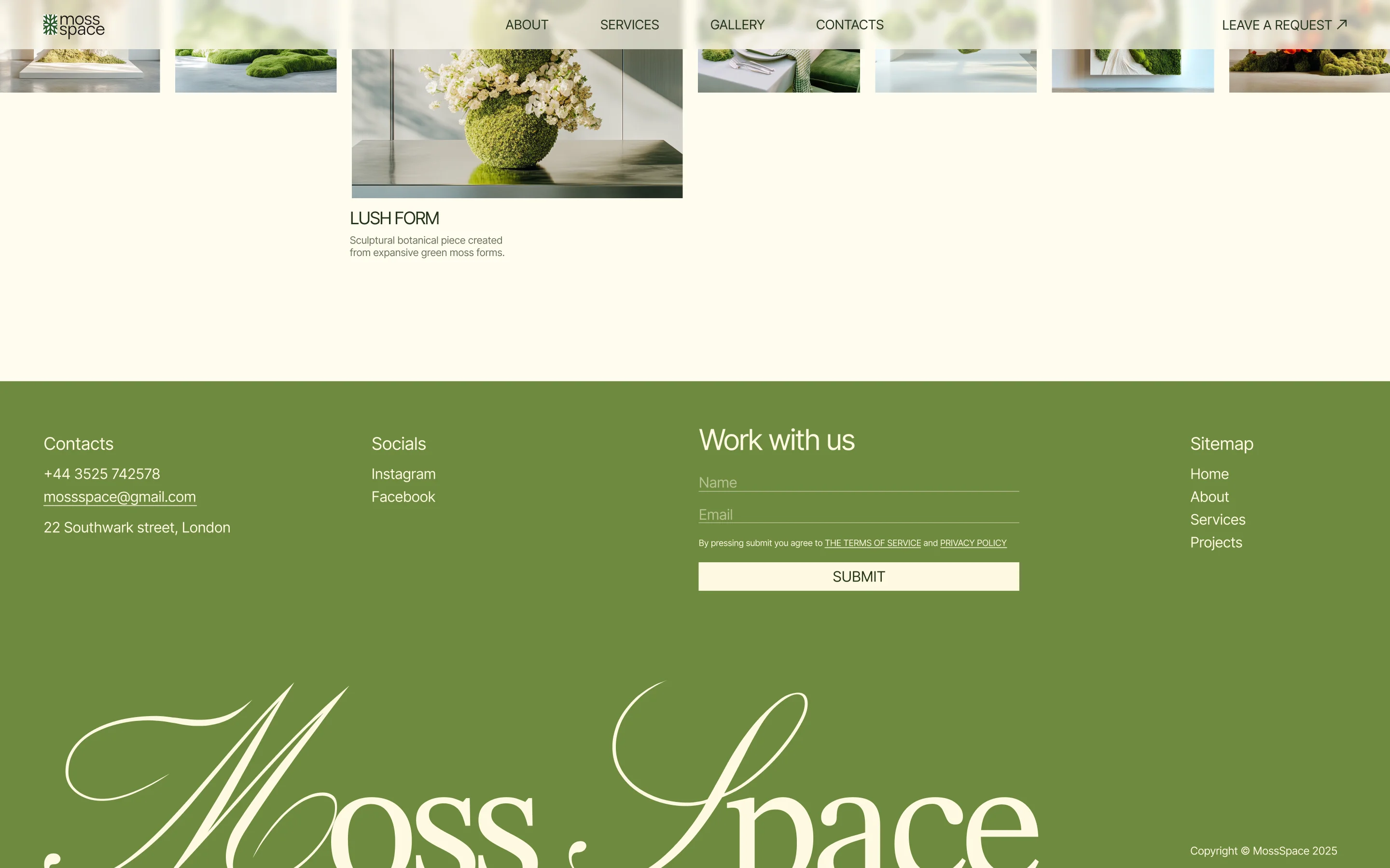
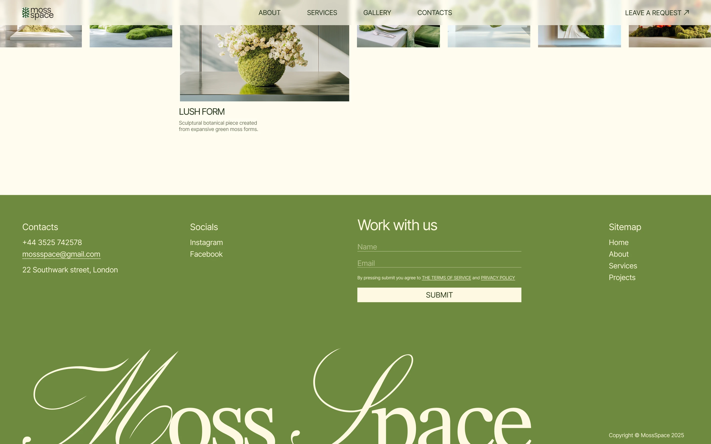
The “Leave a request” button stays in the header as the page scrolls, and the short “Work with us” form closes every page.
“A website that brings in requests for custom projects”
Process
Research
Competitive analysis
I analyzed two studios that make moss walls, The Moss Box and Emerald Green. I looked at how each one shows its work and earns a visitor’s trust before a custom order.
What worked
- Photos of real projects
- Clear navigation
- A large portfolio and well-known customers
- Contacts in the header and the footer
- A contact form on both sites
What didn’t work
- Neither studio showed its team
- Neither stated a guarantee
- One studio gave few details about its services
- A video on one home page made the site slow to load
Both studios were easy to use, but the one with more proof of its work looked less refined. So I paired a calm, modern look with proof on every page.
Structure
Information architecture
I designed five pages for the site. The line shows each page with its blocks, top to bottom.
Prototype
Wireframes
Visual Design
Visual style
The brief asked for a stylish, minimalist look with natural accents in shades of green. I kept the greens on a cream background and added warm copper for the project and material cards.
Typography
Colors
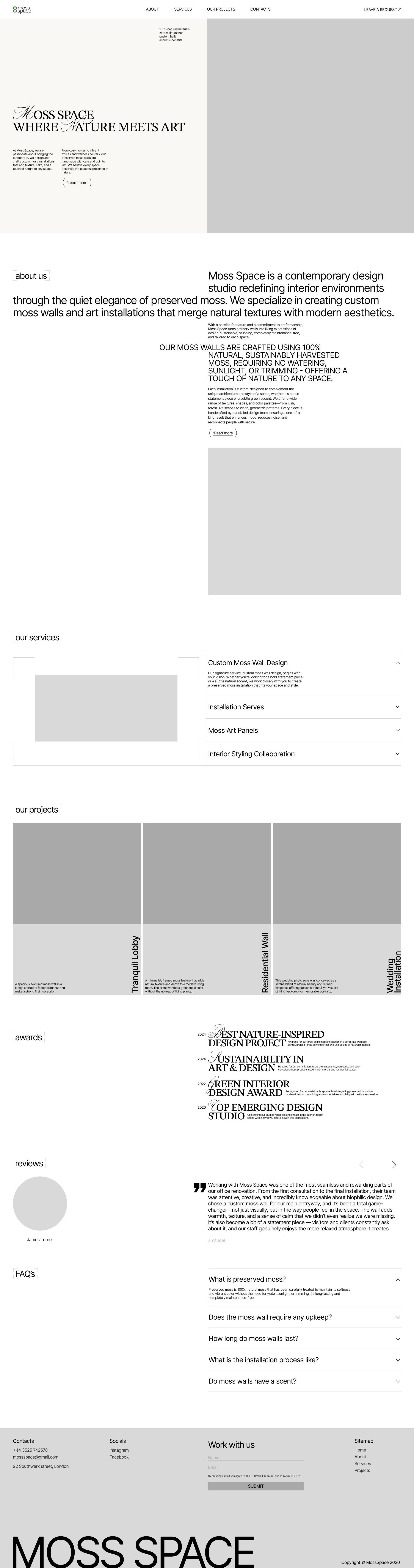
Home
- First screenStudio name, short introduction
- About usWho the studio is and what it makes
- Our servicesFour services with descriptions
- Our projectsThree featured projects
- AwardsFour awards by year
- ReviewsCustomer reviews
- FAQFive common questions
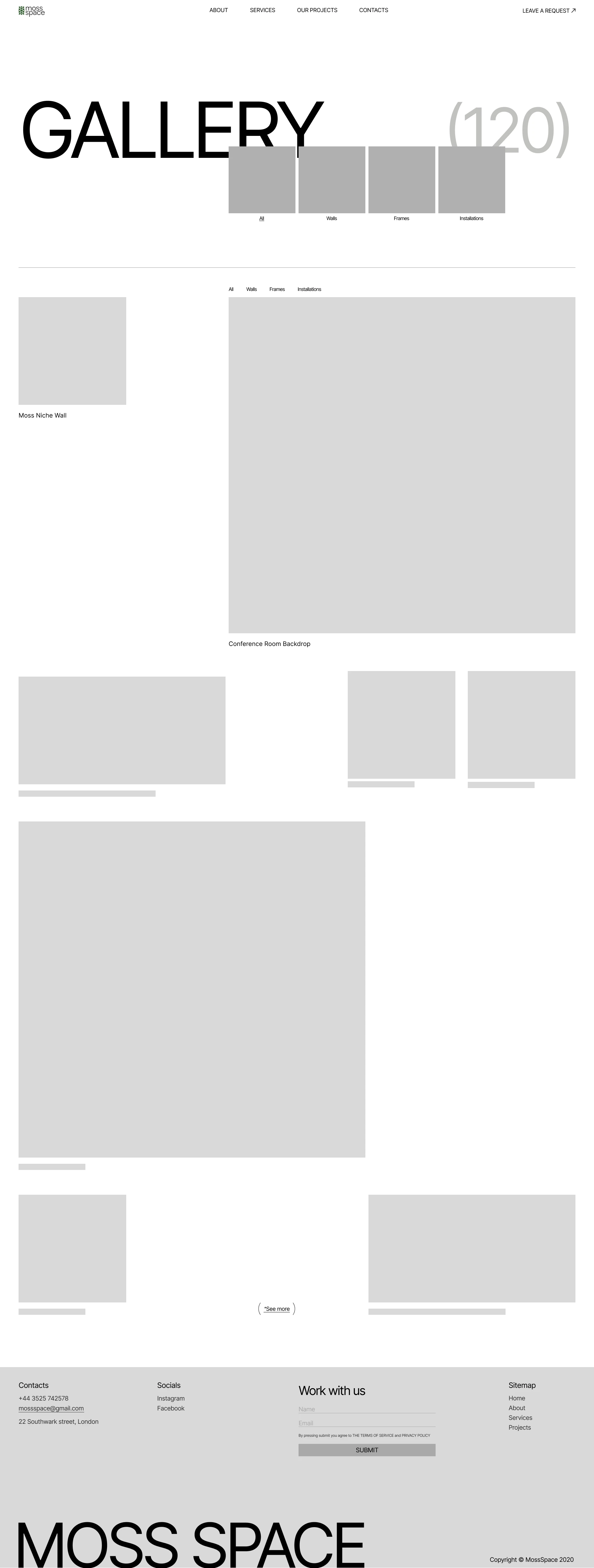
Gallery
- ProjectsPhotos of the work by type, each opens its project page
Project page
- DescriptionProject photo, name and description
- MaterialsThe moss and plants used, each with a photo
- The processSeven steps from consultation to final walkthrough
- ReviewThe customer’s review
- Other projectsA slider of more projects
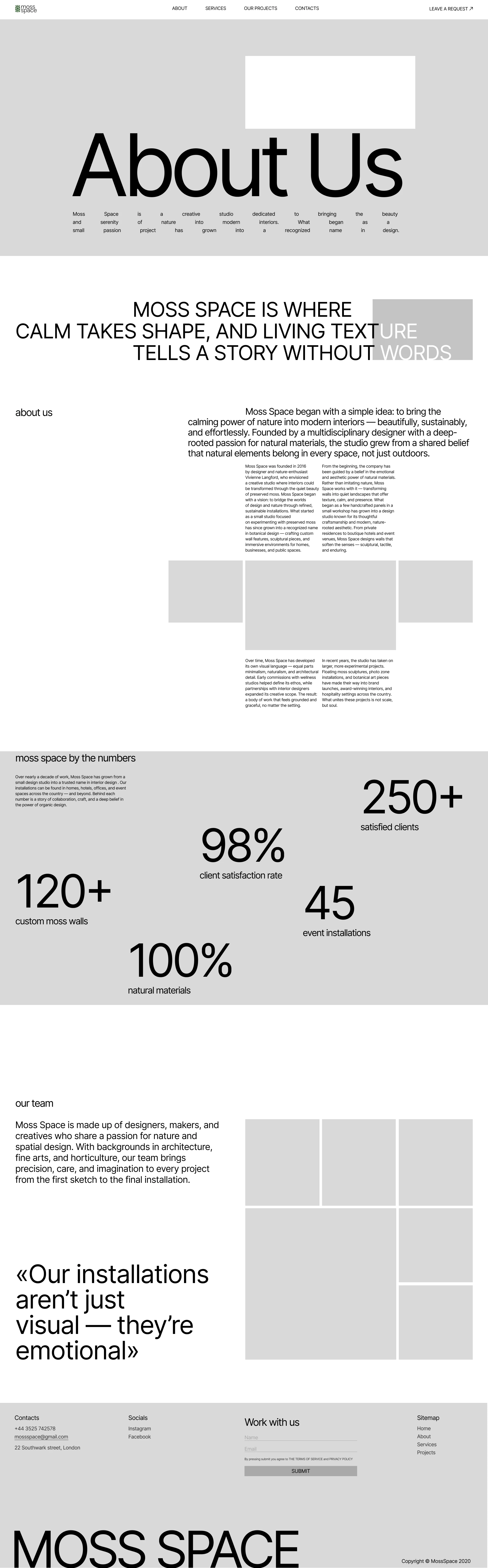
About
- About usThe studio’s story and its founder
- By numbersThe studio’s work in figures
- Meet the teamThe team at work and their backgrounds
Contacts
- Contact detailsAddress, phone, working hours
- MapThe studio’s location
Home
Gallery
Project page
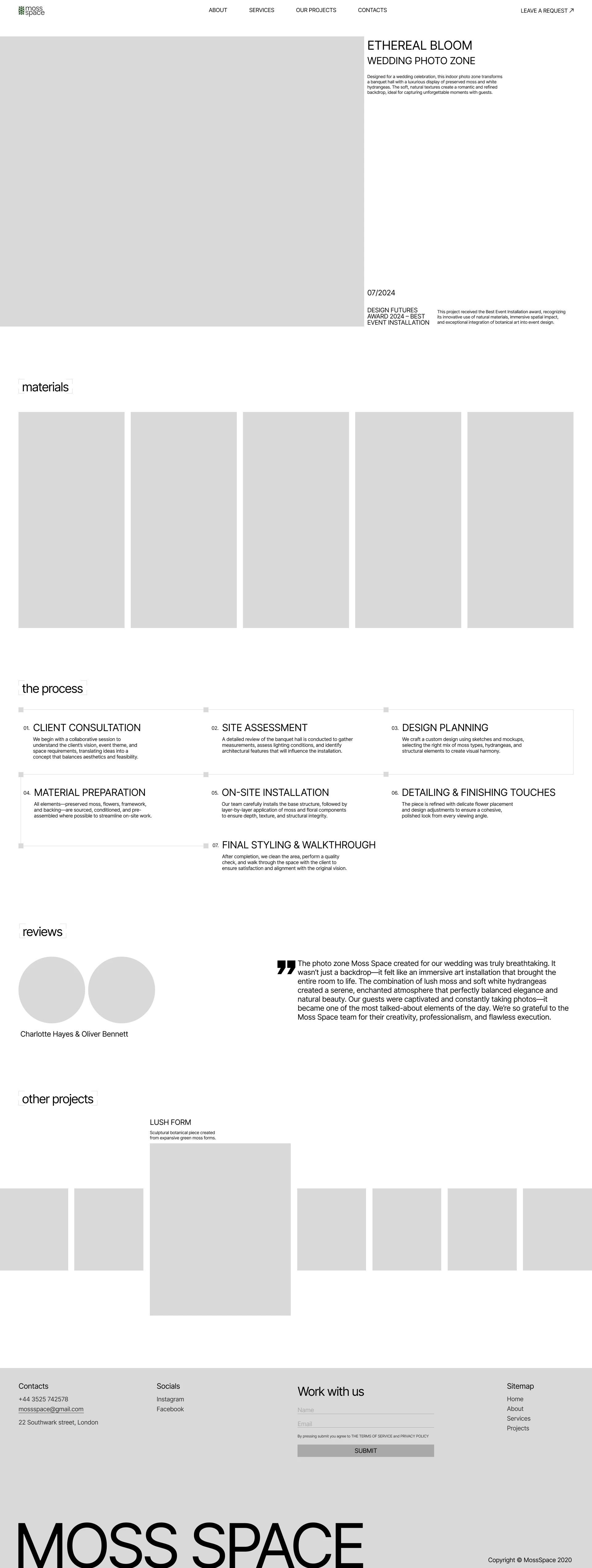
About
- STIX TwoHeadings: a classic serif
- Classica OneInitials: a decorative script
- InterBody text: easy to read

Final design
Home
The home page opens with the studio’s style, and its projects, awards and reviews follow.
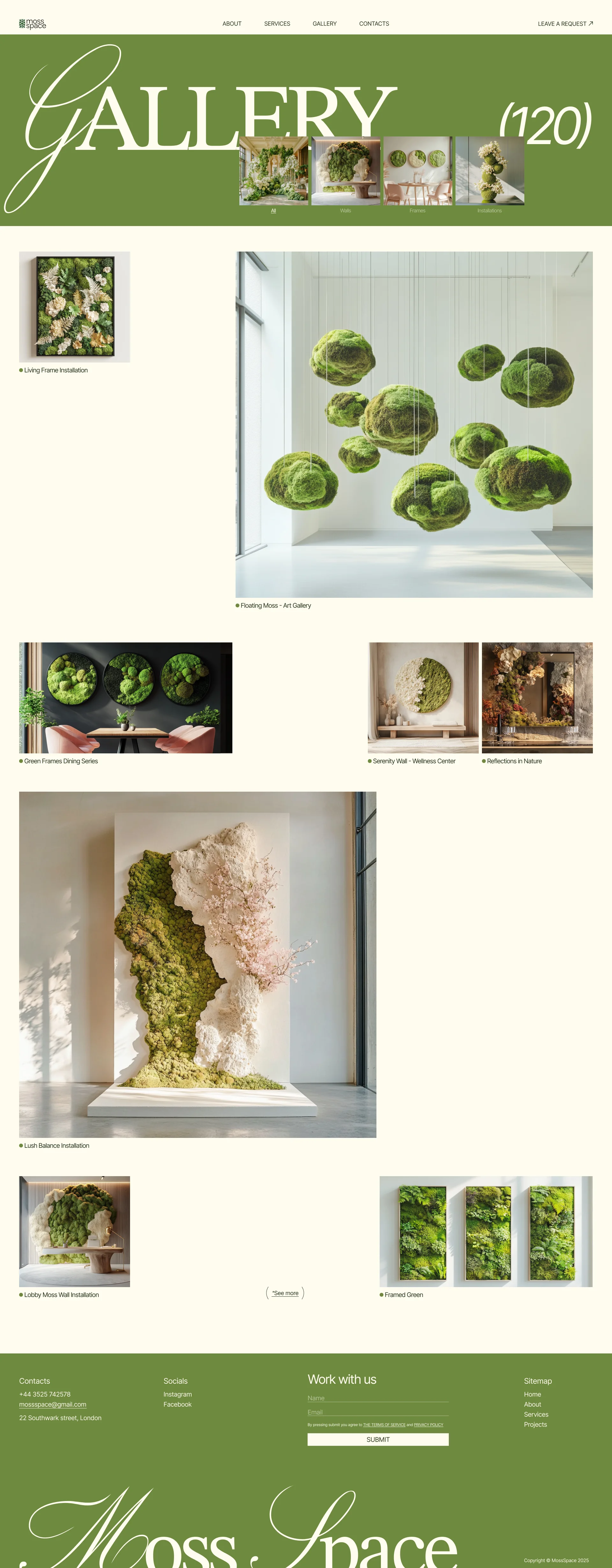
Gallery
A visitor picks a type of work and opens any project from its photo.
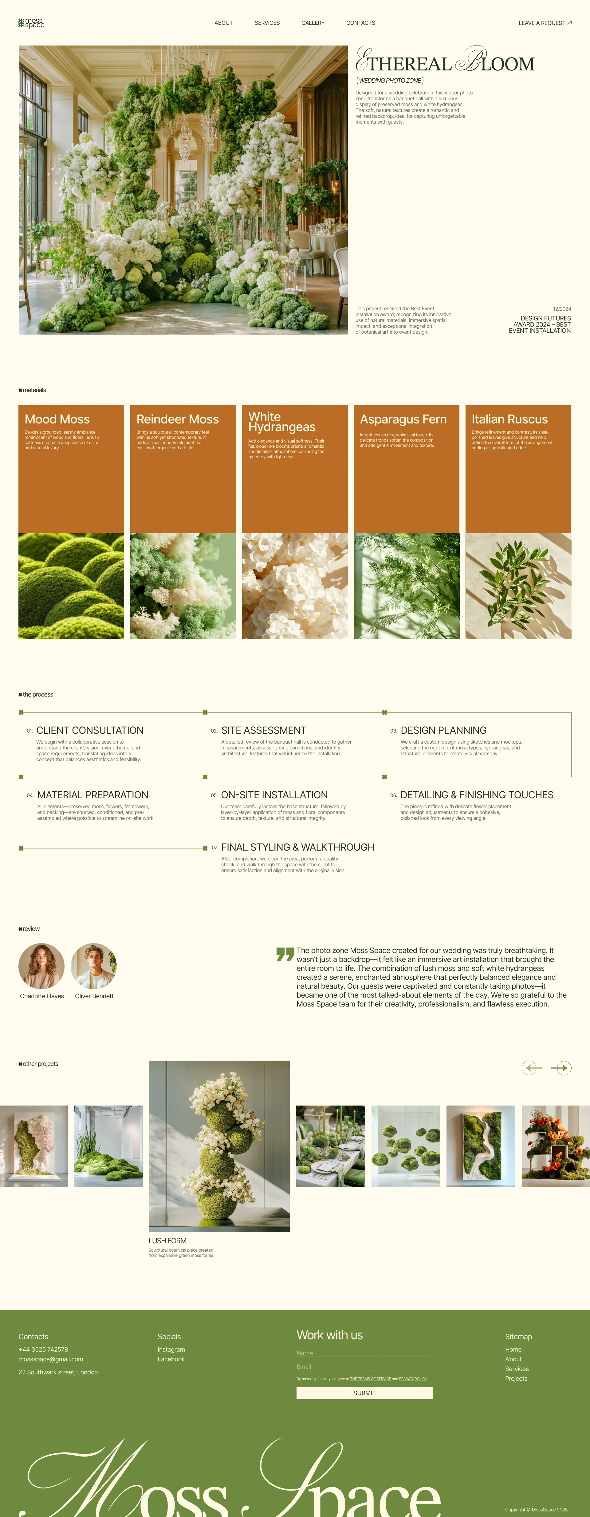
Project page
A visitor follows one piece from its materials to the customer’s review, then opens the next project.
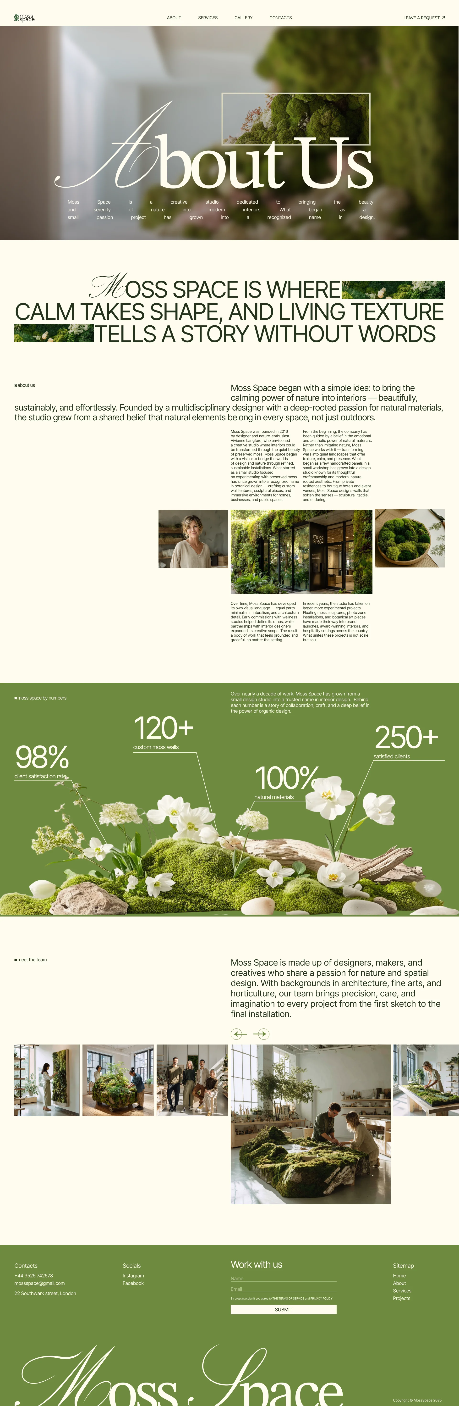
About
A visitor reads the studio’s story and sees the team at work.
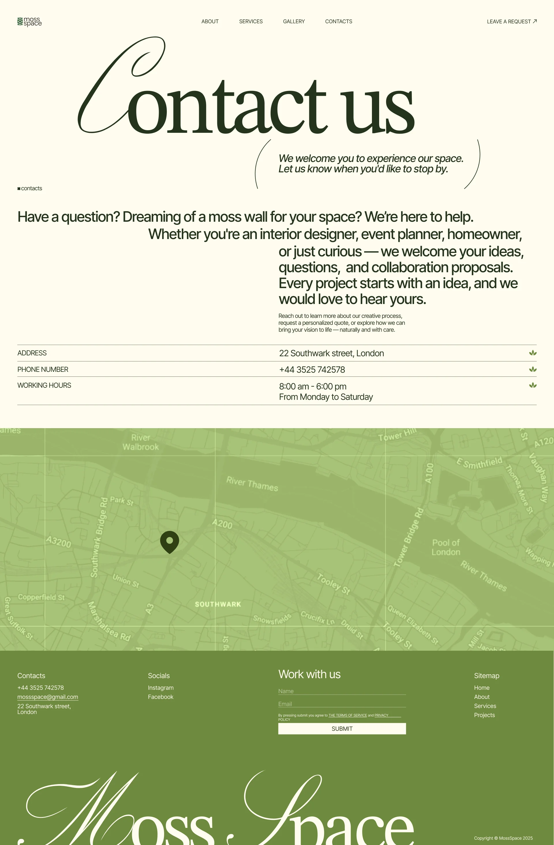
Contacts
The address, phone and working hours sit above a map.
Reflection
What I learned
On Moss Space I learned to show a business’s mood and vision through design. I kept the site as minimalist as the studio wanted and ran the proof of its work through every page.
What I’d improve
I’d add a blog with project stories and award news, so visitors can see the studio keeps taking on new work.
Next steps
Next, I’d test the site with interior designers and homeowners: can they find a project like theirs and leave a request without help?